New and old, low-key and high-end, market and comfort, these three pairs of antagonistic words often appear in discussion of design life in old but fast-changing Beijing.
It is nearly 100 years since the Republic of China this building has been standing in the ancient city area of Qianmen Dazhalan in the center of Beijing. This building has changed from a residential building to a spare parts factory, and then to a Mahjong chess and card room. After several transformations, it has changed several times. The former orders dismantled the facade of the entrance and then made a metal and glass door in order to let more people in, which makes the building weird in the old hutong area. I found this discrepancy when I received this project and then figured out that the change of the facade is set so subjective and unreasonable which the neighborhood can not accept. In order to solve this problem, I went to the local archives to find the files including the pictures and the blueprint of the original construction of the building, knowing its original appearance. The original facade was a typical double-deck multi-arch facade built of stone blocks during the Republic of China. I choose concrete to build a new arch structure and facade, because the old stone materials cannot be found, using the material and the shape to match the history as well as adjusting the form and proportion according to the character of the material controlling the roughness, details and the sense of period. We washed the arch concrete template when the concrete set, and combined as we wish in the facade above the first floor, to make the historical picture of double-deck and multi-arch reappear through modern design and construction. The using of the template decrease the loading for the second floor, which is necessary for the "dangerous building" with nearly 100-year-old block structure. By the meantime, it is smart and environmentally friendly way to save the use of building materials and achieve multi-use of one material. Because this building is located in hinterland of the Qianmen Hutong area in the center of Beijing, it is very difficult for vehicles to enter and transport building materials. The texture of concrete and template in the two floors are corresponds to each other and printed or copied by each other, It was manual calibration, showing the unique balance between the concrete and the wood. Also this building is one of the few scattered buildings with two floors. People can see the terrace and the human activity in the balcony far away from this Hutong. The entranced facade of the building is protruding from the lane a little, for reducing the abruptness and acuteness of the skyline and rectangular corner of the terrace. I use the wood combined with the comprehensive materials to make the semi-circular box railing ,lighting inside by the circle light. From the lane during the day, we can see soft and elegant outlines and transitions of railings and terraces. At night, we can see the curved halo in the black sky. It illuminates the street and the terrace, adding surreal signs and fun to the dark grey alleys.
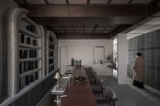
Enter the entrance, through the small glass hallway, there is the lobby of the bar, the concrete arch from outside to inside making the image of corridor. The materials like bricks, stones, concretes and the woods corresponding to the Republic of China era. All the materials were hand made on the spot and avoid the use of modern industrial materials and disposal methods that are inconsistent with geographical and historical times in the design and construction process. This building can make people feel like they are sitting into the original moment in the history. I n the past near 100 years, this building took over by different people, the wall and the floor changed every time when the new owner came into, such like painting or paving by their individual subjective will. I remove and clean these covers and decorations, washed the building to complete what I call“taking off”process, to restore their original appearance. Compared with architects, I am the archaeologist and restorer of this project. I carefully excavated and organized the scene, and fill in the "loopholes" of space with modern materials and processes in an imperceptible way. The user's feeling has also received great attention. The bar which runs through the lobby from north to South separates the mixing area and the retail area. Seven retails are equipped with spot stage atmosphere lighting on the bar and under the bar, and can be independently switched and adjusted. At the same time, they are equipped with independent USB, guiding floor lamp and independent audio facilities, and each retail has its own space. Light and sound do not interfere with each other because of the appropriate spacing, which gives every guest a "first class" feeling. Modern equipment and appliances such as air conditioners, equipment, lamps and pipes in the lobby are hidden in the walls, ceiling and bar counter. No violation or intrusion of modern equipment and appliances will occur within the scope of the guests ‘sight. I call this control principle "Disney-like" design of "atmosphere", which can make guests enter a complete, self-consistent and closed-loop time and space experience when experiencing. Including the overall settings of products and atmosphere, surrounded by "the present", like the "theatre" of dreams.
Passing through the individual lobby, we need to go through the long corridor. On both sides of the corridor are clear water brick walls washed by salt water, along the guiding floor lights, through the concealed glass doors, the space suddenly opens up, and we reach the real courtyard. The quiet and private courtyard in Beijing is hidden behind the corridor. From the arch entrance to the courtyard, the spatial streamline is decomposed into several sequence segments of different sizes and lengths. The flowing space makes the process smooth and difficult to detect. This metaphor indicates the real positioning of the bar: the speakeasy bar in the hinterland of the Qianmen Hutong area in central Beijing, a hidden place with the courtyard as the background. The word "QUAD HOUSE" has the meaning of a private place surrounded by surroundings and centripetal, as well as a square land surrounded by houses in east & west, south & north. In addition to SiHe Pinyin, I use the word "QUAD", which corresponds to the spatial layout of the building from the ring surroundings and the number four. I hope the architectural design can be as convincing, accurate and elegant as this word. This independent courtyard has two private rooms and a large bathroom in the north and south. The windowless gable of the neighbor's bungalow is on the West side, and the gable after the restoration and elevation is on the east side (mirroring the gable of the West wall).In addition to the surrounding buildings, only the ground and the sky ensure complete safety and privacy, but also highlight the spirit of the place, that is, the main relationship between people and environment, people and people, people and self. It is very difficult to obtain such a powerful purity. It is necessary to shield unnecessary forms of content in the design process, so that guests ‘attention is focused on the most authentic color and material of the material. In the design process, I have been trying to keep silent, control the harmony of the overall environment and atmosphere, and do not over-design and expression. Beijing's natural climate is changeable. I set up a fireplace in a corner of the courtyard and connected the East and West Gables with a linear lamp groove in the sky. In the evening, the swaying flame reflects the light floating in the night sky. It synchronizes with the light emitted by the entrance and exit of the bar and the lamp groove in the arch of the bar, and evenly changes color. It gently illuminates the courtyard. Temperature and illumination reach the hearts of the people at the same time, leaving an unforgettable breathing moment in this special area.
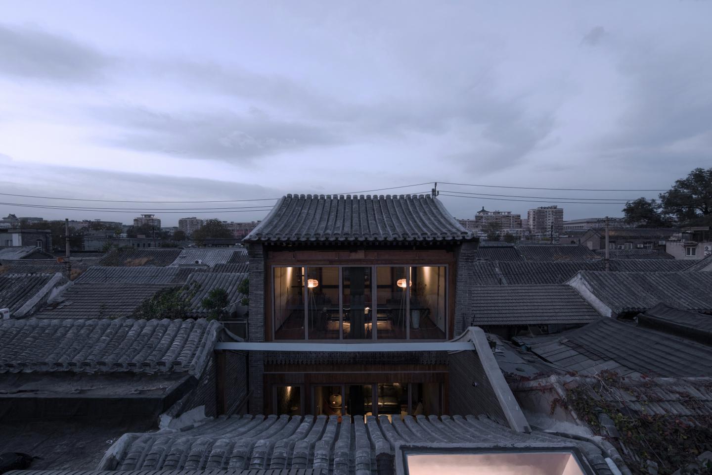
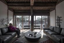
The corridor mentioned above has a branch line. Up the stairs, you can reach the second floor of the building. Turning to the south, you will come to a large independent private room. It is very difficult to retain the second floor of the building. When the building is rebuilt and repaired, it is a dangerous building. At that time, the wooden floor and the second floor roof had been weathered and had to be completely demolished. The old masonry wall had been distorted. I use the steel structure to reinforce and build the second floor again, and made precise proportional control by referring to the number and size of ancient buildings. In this way, I used concealed installation of air conditioning, hydropower, rainwater and lamps, wrapped the steel structure with wood and rebuilt the roof. The twisted walls are corrected visually by multi-level and multi-paragraph material transformation. In the meanwhile, hidden the trace of design is what I did, make the user focusing on the natural environment and sloping roof outside the glass curtain wall of the second floor private room to believe that what they seeing is the same scene 100 years before but also enjoy the convenience and comfort of modern life. Turn north on the stairs on the second floor, there is the balcony which has two connections to the inside, making the circulation. Staying on the balcony, seeing the waving roof from north and south, like the ocean push the waves toward, where people can see the child playing on the roof, in the central of the waves. These scenes have never change near a hundreds of years. People can see the ancient Qianmen tower, the present Great Hall of the People, the CBD building which will be built more than 500 meters high in future, it makes people feel a little surreal, a little unique, a little imagination and a little charming. When people chat on the terrace, they also become the scenery that the lane tourists seeing, like the opera actors in the theater holding the wine on the balcony.
2018
2018
Project name: QUAD HOUSE
Project location: Beijing, China
Project type: architecture design and interior design
Project status: built
Design starting date: March,2018
Design finish date: May, 2018
Construction kick-off: July, 2018
Construction complete: November, 2018
Gross floor area (m2): 220
Interior floor area (m2): 180
Detail design & Implementation: ARCHISTRY design & research office
Construction: AMRITA workshop
Principle architect: Nolan Chao
Design team: Nolan Chao, Na Cheung
Photographer: David Chu
Video: Yang Bo


