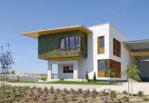
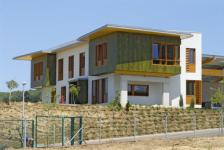
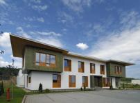
The headoffice building designed by Ferdinánd and Ferdinánd Architects stands out from the industrial buildings of the Biatorbágy area: the way it is located is outstanding by itself, on the top of a steep hill, it is dominating the area bellow, - however its shape also brings a new wind which is definitely in contrast with the usual industrial objects of the neighbiurhood.
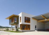
Location: The two blocks of the building cut their place with strickt line into the steep hillside. Behind the headoffice building which dominates the sight a wharehouse was erected which is connected to the main block by a slim bridging element. In the design of the wharehouse the puritan functionalist norms of industial architecture were fully adhered to: the 1500square meter rectangle shaped block was divided into ships. This outside of the wharehose block was given a plain white colour, it was made of prefabricated reinforced concrete, and a very simple 8 meter high storing room was created inside.
An entirely different concept is reflected both in the shaping and in the selection of materials of the main block.
Materials:
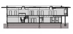
The reresentative wing was built on a two storey concrete foundation using BINDER BBS wooden panels. Both the supporting walls and the separation walls were built by these panels, furthermore this material was used for the roof covering. The wooden panels are made of pinetree layers put on top of each other in opposing directions, these layers were then pressed to create a very strong material. It has good vapour barrier facilities, and can store internal temperate very efficiently. The prefabricated panels were cut to size based on the plans provided by the architect and were assembled on the site within 10 days. Probably this was the shortest work phase of the overall construction period (six months altogether).
Form:
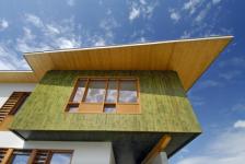
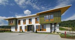
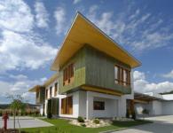
The somewhat trapezoid-shaped block is connected to the bridging block with a sligt inclination. This homogeneous block is only broken on the left and right front corners of th second floor by protrusive cubes - they look as if they were separate objects put on or rather into the building. the buildings simple geometry is also broken by the bold roof element that follow the line of the second floors facade.
The color of three protrusive cubes catches the eye: while the ascending wall structures were all covered with light pastell silicate plaster, on the protrusive blocks the surface of the BBS elements were left practically bare, they were merely treated by a thick transparent layer to provide UV protection.
For the first sight the facade looks symmetric, however the wooden cube on the right corner of the building was given more emphasis, it is somewhat bigger, also the entrance is instead if being right in the middle of the facade was draw slightly to the right. This accentuated shift to the right is justified, since other parts of the building complex, such as the court, the open and the covered storage area can be accessed from this direction.
It was the owners objective to have a building designed that fits with the companys functional requirements and whose appearance also refers to the companys activity: these objectives were met, the headoffice provides excellent examples on how to utilise the BBS panels creatively.
In general the house looks graceful, young but stable at the same time
2006
2007
Type Commercial - Office, Retail space
Location Biatorbágy
Hungary
Client Pannon Falap-Lemez
Building status built in 2007
Number of stories 2
Site size 2800 m2
Site type other
Building area 2600 m2
Budget total 1600000 USD
Arpad Ferdinand
Krisztián Nagy
Favorited 1 times

