Booksea Publishing had been planned 4 years before, and at that time the client was happy about the initial plan. As time went on, the initial design did not much satisfy me; it is rare for a building to be planned again with architect’ s whim under client’ s consent. The building is basically ‘L’ - shaped by PaJu building guidelines. Thus, the lower two levels are wide, while the upper two levels are about half size. Since the building area instructed by the initial draft plan was not much wide, it was possible to create the masses of different sizes and materials within the contour specified to float in the space. The stairways connecting the mass spaces are combined with the voids linked with each other in a complicated way to characterize the building. The new draft plan could not but aim to maximize the total floor area as well as the floor area of each level, namely, stack up the levels. While talking with the client about rent and use of the building, I came to know that the lower two levels could be divided into each two spaces, and such a division was the starting point for the plan. The height of each level would vary within the entire building height (15m) to meet its program, and the fourth level reserved for living was created into a voluminous 4.8m high space.
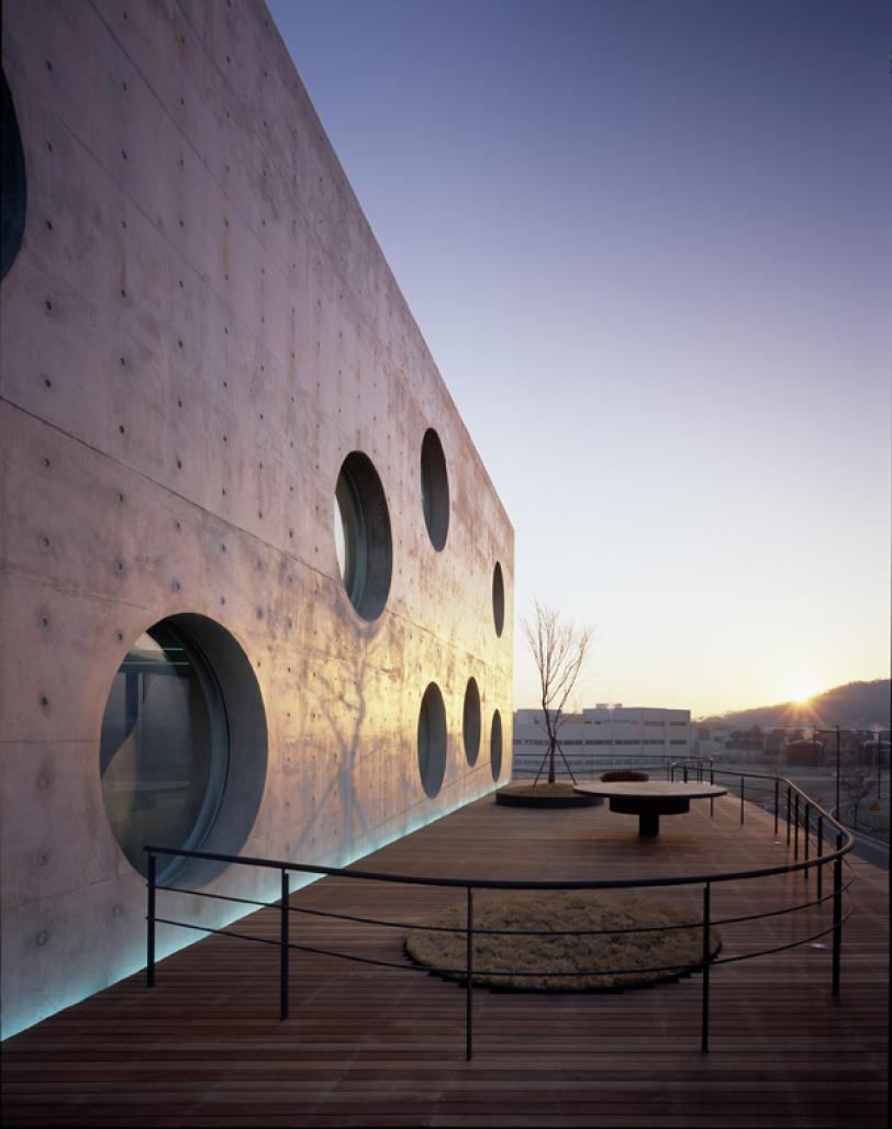
The central wall serving an image of the entire building was set as a tool of interior boundaries in basement and on lower two levels, and of exterior boundaries on upper two levels. This thick wall plays a role of supporting the entire building; it support the vertical load mostly with EPS inside. At first, I attempted to solve every structural problem with this wall, but due to some structural problem and sag of slabs, small section columns were deployed on both sides. The round windows of 2.1m in diameter are positioned depending on the conditions of the interior spaces; they are used for communication among interior spaces, or windows leading to outside. The lights penetrating through these round windows serve to create diverse landscapes inside, and thus, elapse of time may well be perceived by means of the shadows varying over time during day. The pattern of the balcony on the third level was designed to reflect such lighting conditions; the handrail is recessed from the slab to look free, and therefore, one may enjoy the views freely at the new yard in air.
2004
Favorited 1 times


.jpg)
.jpg)
