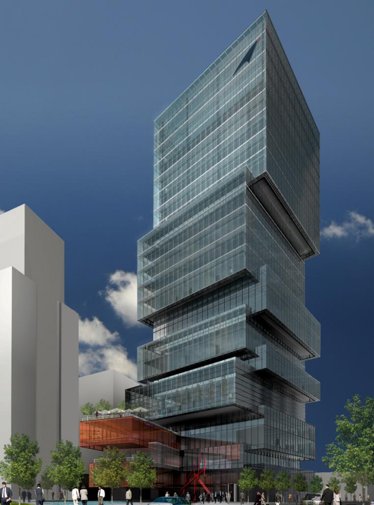
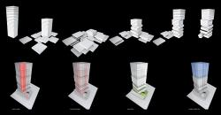
our conceptual approach is to disassemble the typical monolithic tower into distinct individual floor volumes that can be reassembled, grouped and stacked to create a sculptural form that has a strong dialogue with both the pedestrian and a larger urban context. visual registration of individual floors is typically lost on a tower beyond this height; however, at 24 stories, the scale of the proposed tower can still be visually measured by the viewer at street level or from distance within in the city. consequently, individual floor volumes can be used effectively as the building blocks for the development of a tower form. the image of randomly stacked mail envelopes and mail packages provides a visual clue to the proposed tower massing.
within the tower, single floor volumes are composed together with a variety of multi-story volumes to form a vertical stack. the low-rise portion of the tower is composed of single and double-story volumes, and multiple floors are grouped together higher up in tower to create larger volumes whose scale is more appropriate to s in the skyline.
the large penthouse volume is composed of 6 typical floors to accommodate the specific post office area requirements and features a dramatic triple-height sky-gallery with panoramic views of city and surrounding mountains. the transition between each floor grouping is characterized by an alternating 3m shift to the northeast, and southwest. the alternating cantilevered volumes of the tower appear to perform a subtle dance as they extend upward from the ground.
the typical 1000 sm tower floor plate is composed of a 30m x 30m square based on a 1.5m window module and 9m structural bay. the alternating 3m cantilevered shift from volume to volume creates a perimeter column-free executive office zone on two sides of each floor and a typical core to perimeter dimension of 9m. the lower floor of each multi-story volume features an l-shaped perimeter landscaped terrace.
the typical floor plate features a modified central core containing the 4 tower passenger elevators, service elevator and vestibule, egress stairs, mechanical, electrical and communication rooms and toilet rooms. although the massing features significant sculptural movement, with the use of a central core and the proposed alternating floor configuration, the integrity of all tower columns can be maintained throughout the tower and an efficient structural frame free of complicated transfers and additional support columns is possible.
at the base of the tower, a series of long rectangular single-story volumes are stacked and splayed along the southern edge of the site to maintain a dynamic yet substantial 4- story street wall along avda. general mackenna.
the ground floor of the podium is left partially open to provide a view into the site and permit the free flow of pedestrians through the street wall into a plaza entry court located at the northeast corner of the site. an elevator tower extends up from the plaza into the podium to provide direct access to the restaurants located on levels two and three.
the office tower lobby occupies the northwestern portion of the site, with direct street frontage along avda. presidente balmaceda, and primary pedestrian access through the landscaped entry plaza at the east side from morande. a café is located just off the lobby with exposure and access to the plaza.
the ground floor post office is located adjacent to the office lobby in a volume that extends to the southern edge of the site slipping under the cantilevered podium. this prominent position fronting both the entry plaza off morande, avda. presidente balmaceda and avda. general mackenna gives the post office high visibility and easy access from all perimeter streets.
each of the typical single and multi-floor volumes are clad in a high-performance glass curtainwall. the curtainwall features a fixed 3.6m floor to ceiling vision glass unit and 400mm spandrel shadowbox unit on a 1.5m module. a secondary façade layer of full-height glass units hang 1m in front of the curtainwall to form a delicate veil. this exterior layer of glass is treated with a series of low-e and ceramic coatings designed to address the specific solar exposure of each façade.
the podium volumes that form the street wall along avda. general mackenna are clad in a series of glass facades that incorporate a number of glass technologies to create facades that can appear both opaque and transparent when viewed in various lighting conditions and directions. the use of copper mesh laminated glass provides enhanced solar protection and can appear as a shimmering opaque metallic surface that relates strongly to the local use of copper roofing, yet be highly transparent from the interior. screened glass technology gives us the ability to create a glass surface that appears completely opaque from the exterior and transparent from the interior to maintain views and light transmittance. these proposed glass facades allow us to maintain the solidity and weight of a traditional masonry street wall façade, while offering the transparency and flexibility of fully glazed walls.
2007
2007
Client: Correos Chile, MOP( Ministerio de Obras Publicas)
Facility: Headquarters Office Tower, Post Office, Restaurant, Amenities, parking.
Size: 27,000 sm
Status: Competition Design Winning Submission- SECOND PLACE
Architect: ZERAFA ARCHITECTURE STUDIO
Design Team: Jason Zerafa, Eduardo Carmona, Carolina Meller, Francisca Noguera
Associate Architect: AATA Arquitectos
Structural Consultant: Ingenieros Ruiz, Saavedra Y Cia Ltda.


