2006
2008
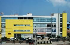
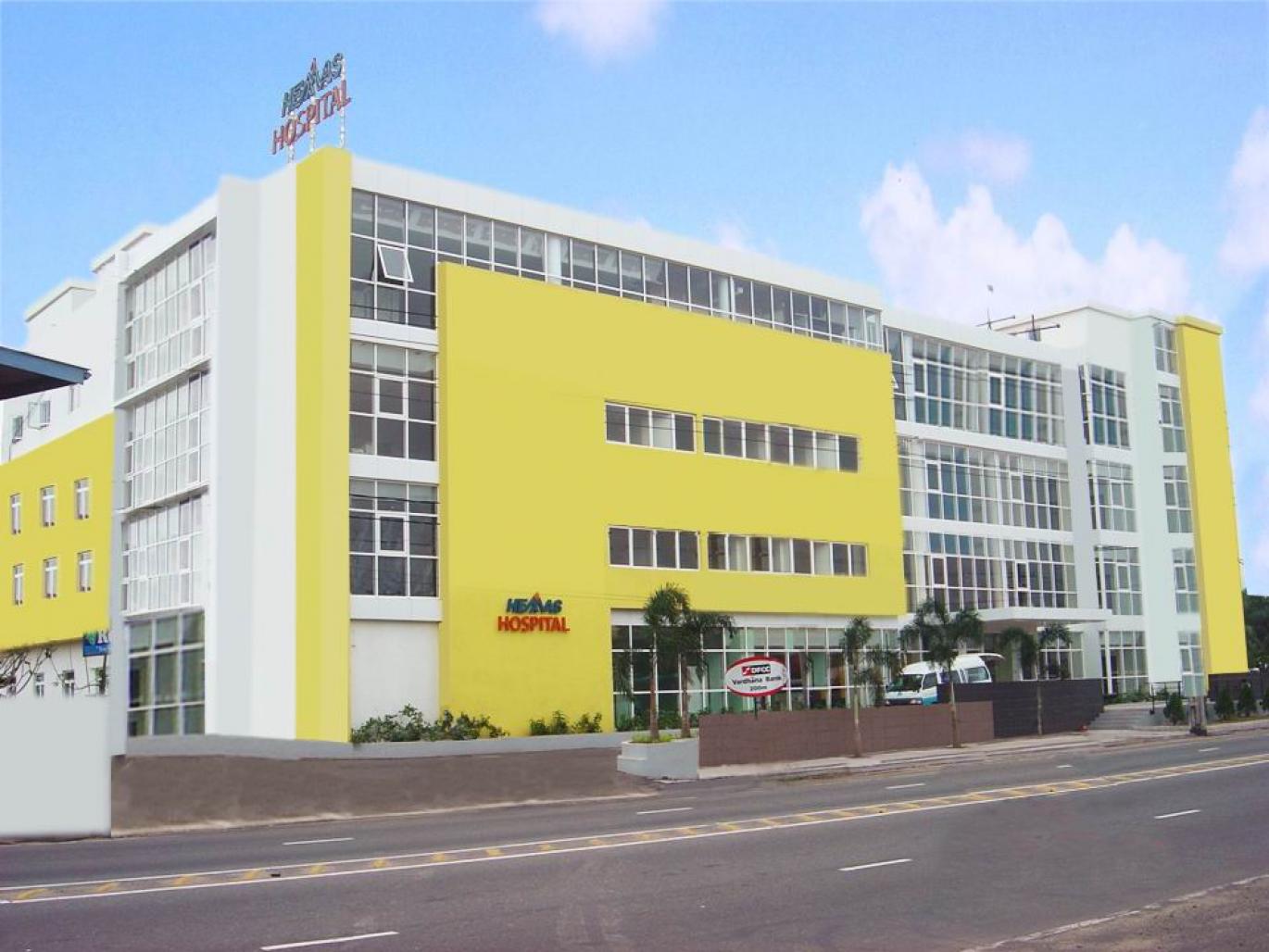
hemas hospital wattala; a four storied, 108,000 sqft, multi-specialty general hospital stand facing the busy negombo colombo main road. the 100 bed hospital provides diagnostic, surgical, radiology, physiotherapy, gynecology, obstetrics and consultation facilities catering to the growing demand in healthcare services in a rapidly expanding urban center.
the design of the hospital and colour concepts was based on who standards & designer noting that colours have power to influence various qualities of life particularly useful in healing. the ive was making the exterior and interior a more cheerful healing environment with energy, feeling, and behaviour, in order to trigger various responses on the subconscious of patents, visitors and staff. colours have been creatively used to enhance this ive, with each of the various hues, shades or tints of colour emitting specific energy frequencies. the resultant ‘picture’ is a dramatic change compared to hospitals with monotonous built elements or colours.
colour concept is addressed in floor patterns and wall surfaces of each interior; furniture and hospital equipment and exterior surfaces in creating a cheerful friendly ‘family’ hospital. colour designs cover all materials and surfaces, including everything light and finishes to art and ambience, from aesthetic to ality. from entrance, to the in-patent rooms and wards, there is a gradual change of colours according to international colour standards for healthcare buildings.
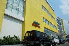
colours which are characterized as positive and powerful are widely used in reception, opd & nurse’s stations and in all inpatient rooms & wards. these are mainly tones of yellow and orange where they help to reduce feelings of self-pity and renew interest in life. also they are uplifting and joyous where it helps staff to be pleased even with stressful work.
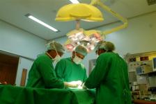
consultation rooms, operating theaters, labour & delivery rooms carries out more sensitive activities both physically and psychologically for both patients and staff. calm grays and tones of blue have been used predominantly in above mentioned areas where it s a feeling of relaxation & serenity for patients, and the staff to be confident and control with sensitive work. white is also prominent in these areas where it gives sense of protection, purity and alleviates emotional shock and despair.
apart from the predominant colour tones of yellow, orange and blue; touches of green are used to a balance and soothe emotions in order to reduce stress in patients as well as staff and visitors. uses of materials in appropriate locations such as the glass façade bring enough daylight to strengthen the powerful healing atmosphere as a whole. the icu is designed to with full spectrum light at the required intensity which is essential to observe skin colour variations particularly in pediatric patients.
hemas hospital was awarded the national construction excellence award for the best building in 2009.
Rukshan Widyalankara (Pvt) Ltd.