THE PROJECT HAS WON US INTERNATIONAL AWARD IN MERIT CATEGORY AT DESIGNSHARE AWARDS 2008. WE ARE THE ONLY FIRM IN ASIA TO HAVE RECEIVED IN THIS CATEGORY. DETAILS www.designshare.com
DESIGN BRIEF
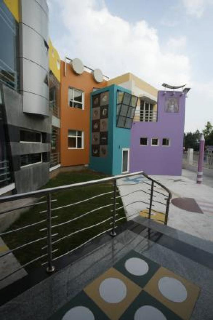
The design required for 5-6 classrooms with capacity of 30 children meant for children age group of 2½-5 year with activity room, Dance & Music room, and Medical room. The reception room should have waiting for around 12-15 people with Administration & Principal room near it. The requirement was to have classrooms well lit up with nature & natural light. Further outer areas to be landscaped & designed for out door activities like swimming pool, slides, skating, assembly space & sand pit. The School was to be centrally air-conditioned. The building to have a character of kinder garden school with use of pastel shades {Client had mentioned the colours used in Disneyland}.
DESIGN PROCESS
The prior emphasis was kept on the functional requirement and the character {elevation} of the building. The building two storied was placed at middle of the site where all rooms should have natural ventilation. The plan kept as simple as possible & only had a corridor connecting all the spaces which over looked the central courtyard. An environment to be created inside which transforms into children’s space, one with which they can identify with, the areas & space they can easily remember and move around. The building plan worked on a hexagonal shape enclosing an open courtyard acts as a secured space for children’s to play.
The building longer side facing the main G.T Karnal road has an entrance from front but the main entrance to be used by children’s was kept from side road {Side road has less traffic & Children’s movement can be monitored properly}. The two entrances are kept at side, one lead to the reception area with the administration & principal room and the other to be used by children’s which opens on to the staircase well leads them to basement as well as first floor. The swimming pool is kept at the comer in the rear side of the plot. Big glass windows gave children’s to have a good view of open areas.
The building elevation was intended to be derived using basic forms of circles, triangles and square. Further it had to differ from castle shaped or fairly tale exterior. It had to be modern and raw in its outlook.
The use of colours & forms used in exterior was reflected in the interiors too.
The foremost attempt in execution of the building or selection of materials or colours was not to loose the character of the building which it was meant for {an apprehension from client that it should not look like a mall}. The landscape was also an important aspect of design with transitional between two spaces achieved by different materials & their colours.
COLOUR COORDINATION
The colours has played the most important part in defining the character to the
building.The selection of colours on the building forms should be eye pleasing,
Therefore pastel shades were the obvious choice avoiding bright or dark colours like
Red, Green, Orange.
The form & colours are like a composition with one complimenting each other and
Not standing apart, its like fruit basket where all the fruits of different shapes &
colours form a perfect composition.
The entrance gate has kept very simple where in longer one rectangular panel has
Painted in different shades of pink, while the smaller one has different circles painted
in pastel shade{distinguishing from normal entrance gates where gate has cutout of
Cartoons to get a pre- school look}.
The central circular element {front elevation}, is in axis of front entrance, is cladded with Al. Composite Panel, which neutralizes with “yellow ocre” colour on Parapet wall at terrace level on either side. The bands of pastel cream blends with brown colour of the corridor walls in front {since “yellow oc
2006
2007
ADHARSHILA VATIKA by KAPIL AGGARWAL in India won the WA Award Cycle 3. Please find below the WA Award poster for this project.

Downloaded 610 times.

AKHIL BAKSHI


Favorited 2 times