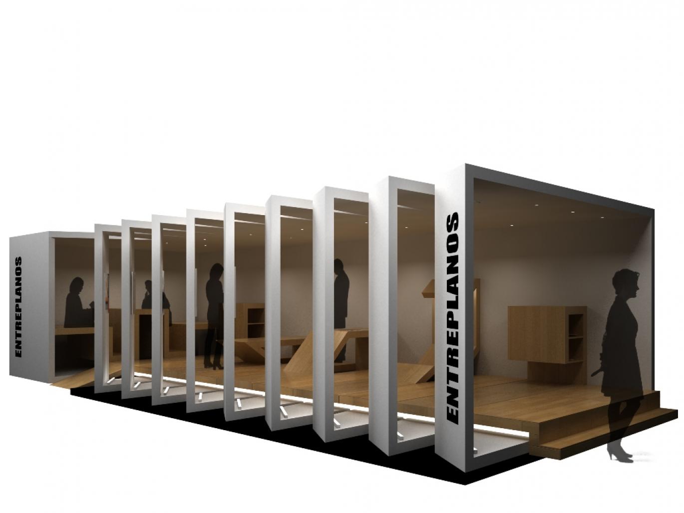
The stand is contained in two well-defined, first peel and also identifies the movable floor-space that gives warmth to it.
The envelope defines the limits and reveals the space with small cuts made to provide transparency, this is understood as a system that leaves evoke a magazine open, ready to be read.
The skin is the same on the inside that contains the display panels of the stand, taking a two-way, first is the corporate image of the stand and another states that the magazine wants to show.
Once inside the booth is the second system, the floor and made furniture emerge generating different spaces, and follow the place of reception, reading room and interview room, a sequence of spaces that accompanied the use of artificial light gives character to the interior.
The stand is intended to have a strong image that attracts visitors who come to do it, but also seeks to recover sobriety as concepts, organization, transparency, simplicity, which we believe are words that represent the brand.
Authors:
Octavio Luqui, FADU, UBA, Argentina
Ariel Orieta, FADU, UBA, Argentina
2008
2008


.jpg)
