: The project posed a challenge of adaptive reuse of industrial warehouses that predated independence to a modern retail condition. While our solution defers to the historical context by retaining and revitalizing intricate metal and woodwork, it is bolder in attempting to tame the cavernous halls with out of scale embroidered patterns that reiterate the graphic quality of branding logo and colours. Similarly, a tree growing out of the front façade of a structure is evoked in 20 feet high AutoCAD tree stencil cutouts of plywood and pasted to inner walls.
SEAHORSE-BUILDING PRODUCT MALL,REAY ROAD, MUMBAI.
Project Report
Almost the entire central Mumbai is dotted with cotton mills that predated Indian independence. No longer producing any yarn, these quaint but dilapidated structures offer numerous opportunities for adaptive re-use. The degree of design intervention has varied from outright demolition to painstaking restoration. Obviously, factors such as intended use, quality of the original design, budget and fortuitously enlightened clients have influenced the outcome.
Design Program and Solution:
This project came with a killer rider. We were offered a certain number of old warehousing godowns in one such mill compound to design for a retail condition. But, it had a shelf life…of about three years. In that time, the entire retail space was to move to a suitable modern building and these godowns demolished to make way for a new construction. The first casuality was the budget. In order to accrue sufficient return on investment over a short period of time, the client reduced the budget to a fraction of normal outlay for such projects.
The godowns were in a state of extreme decay. Crumbling roofs, walls and floors did not do much for our confidence. But in the dark damp squalor, illuminated by occasional streaks of light, we discovered intricate details, cast iron columns of indterminate but flamboyant order, quality woodwork and more.
We decided that in order to truly revitalize and refurbish the space, we had to maximize our intervention without expanding the budget. Since it was to function as a building products mall, we thankfully were targeting our efforts towards engaging the interest of an industry that understood design.
We proposed to keep the basic shell including the walls and ceiling, free of display. The display panels, pedestals and visual merchandising displays were parked as islands in clusters and groups. They derived task lighting, electrical power and even mechanical ventilation from free standing steel columns anchored in the floor.
Exhibit A
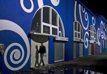
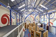
A couple of adjoining halls, one of them 50 feet high, presented a unique challenge. Bereft of any redeeming features in the interior, the cavernous halls seemed barren. We drew inspiration from the brand logo, specifically, the tail of the sea horse and projected it on to the walls. In its dramatic avtaar, the tail curled to become out of scale embroidery patterns cutout in plywood, painted in brand colours. With this design move, the space acquired a degree of freshness and appeal, something it was sorely lacking otherwise. We increased the natural light inside by adding skylights wherever possible and added necessary artificial lighting in keeping with retail display requirements. The graphic patterns of inside are carried on to the front façade in a subtler form.
Exhibit B
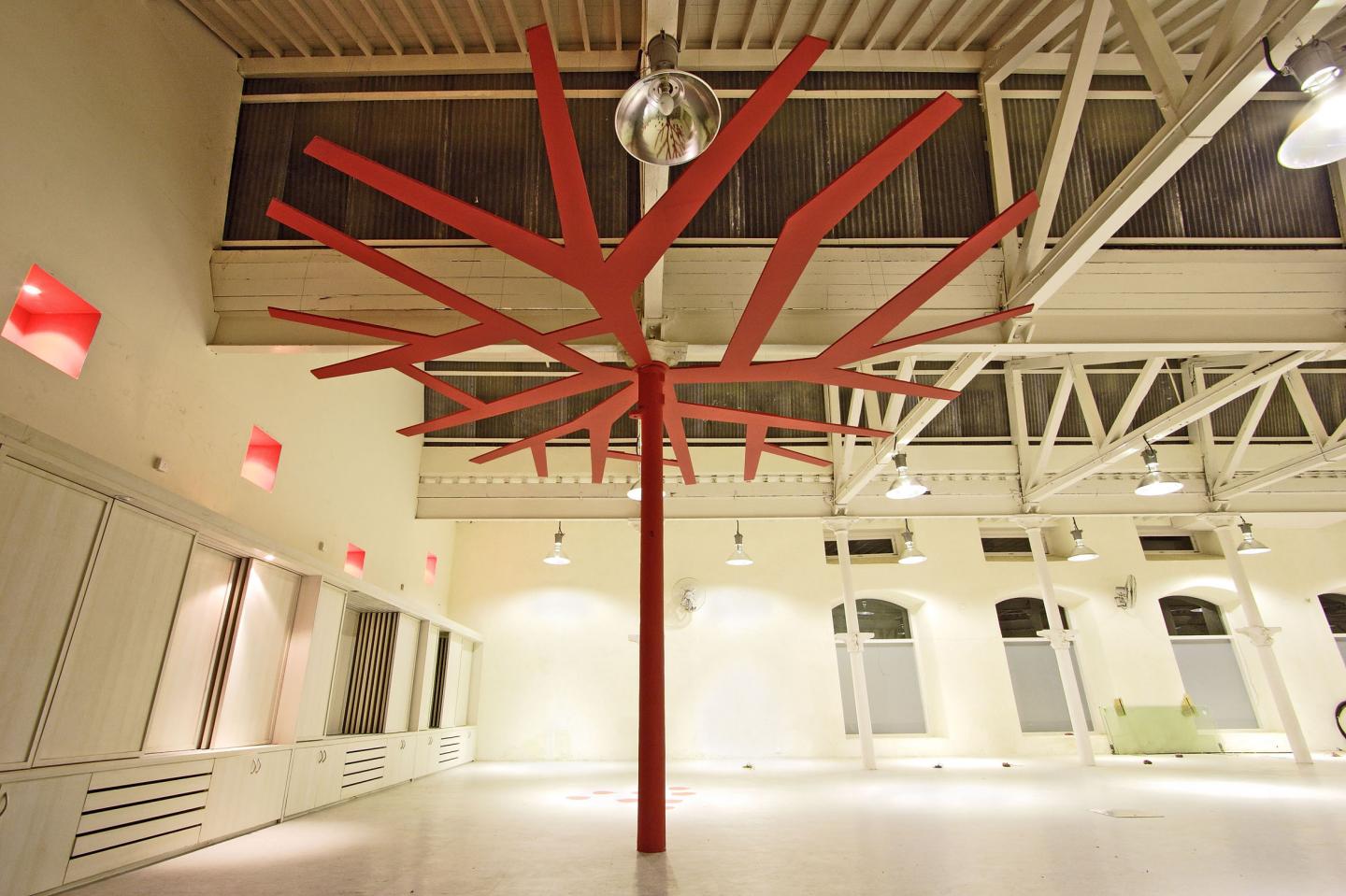
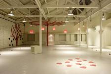
A large warehouse space with wooden trusses supported on cast iron columns. When we first inspected the structure, we discovered a healthy tree growing out of the front façade! We loved it. Unfortunately, the site contractor thought it belonged to Angkor Wat and had most of it hacked before our instructions to retain the tree reached him. With a touch of whimsy, we decided to playfully evoke that tree inside in shape of plywood cutouts on the ceiling and the walls. Having always liked the graphic quality of tree stencil blocks in ACAD, we simply used an elevation and
2006
2007
Mrigank Sharma

.jpg)
.jpg)