ITC SOFIA
close to the airport _ sofia _ bulgaria
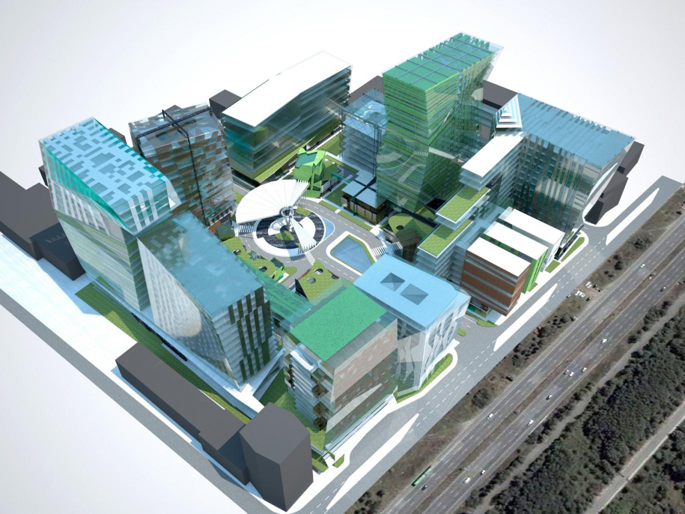
Vertical structures like office building and hotel are placed towards the outskirts of the area.
Areas for recreation, shopping and local supply are to be found in the centre.
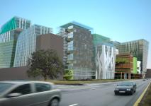
Approaching the property from outside the first sights one will notice are the high rising structures placed on the outern skirts. Significant buildings and individual objects, earmarked for different usages.
A 4 hotel with 200 rooms, equipped with a fitness center which will be open for hotel guests as well as for external visitors is one of these singular objects. Office areas, organized in multiple buildings and placed on the outskirts as well, are planned as high, attractive + elegant structures and are visible from the outside. Flex office space, in terms of meeting standards of different usages, is reached through the integration of a module-system which can get easily and flexibly adapted to provide a maximum freedom for further or changing developments and demands. The modular units start at 200m“ and provide differentiated possible lineups.
The main organisation is bundled in a matrix which leaves a lot of options for expansion.
The buildings around the two main interventions in form of the hotel + the office spaces can be easily reached through their respective development zones like elevators and garages and can be carried to their future purposes which e.g. could be residential areas {with hotel-like infrastructures if demanded} in the upper stories.
The center which is being pre-defined through the existing street gets transformed into a boulevard which is the core to further structures, representing a logical microcosmos, completely transparent and readable. The aim is to create an attractive zone with square-green area sequences and prominent public space, everything is accessible per foot but it is also possible to go there with the car - increase of attractiveness; building of an identity as a small “spot” in the city, scale!
The inner structure, embedded into the center, surrounded by the vertical skylines offers a distinctive special world. The view from the high rising buildings into the lively scenery on the ground offers perspectives and adds to the special atmosphere, being able to watch the dynamics in the center, being evocative of life in big cities where families are taking a walk, people are shopping or going for a coffee. Meanwhile on ground level: Imagine taking a stroll through Rode Drive in Los Angeles, either by foot while able to have a look at the diverse flagship stores, people from the offices taking a lunch break in a restaurant in a friendly, green atmosphere; or by car, driving
through the boulevard, watching the sequence of square and green areas pass by through the windows. The space reserved for the flagshipstores is not divided in single units yet, to keep all options open until the point where it becomes clearer which requirements and needs the different companies have.
The inner core of the property mainly serves 2 purposes:
1 recreation area for the office locals; spare time + water areas, restaurants + cafes
2 visitors. attracting them through a strategical integration of flagship stores of world famed luxury brands like Prada, Gucci, etc.
town centre gets interesting for visitors, connection to individual traffic as a “car promenade”
shopping is not the main purpose but fulfils representative character, it encourages walks on the promenade. as it is relatively far from the city centre {but properly developed for public- as well as individual transport} it is vital to provide “additional value”, especially for people coming from the other districts of the city to spend their free time
further possible secondary structures: galleries, cinemas, space for concerts, events and markets etc.
2008


.jpg)
