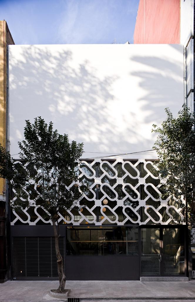
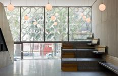
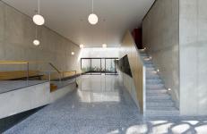
La Capital has infused a modern twist on the cantina while evoking its spirit through the volumetric qualities of the tall, narrow space inside. The elements within it are organized functionally, with all the utilities and service spaces pushed to one edge to allow the rest of the space to be free. The entire building is compressed into a single volume, allowing the kitchen to spill out onto a back terrace. The slope created by the parking ramp is reflected in the restaurant above, where it becomes a series of seats that break up the single space, making these a place of observation and exhibition. The openness of the space makes it a place to see and be seen, and it allows for connectivity for all who inhabit it.
This idea is also reflected in the screen that makes up the middle portion of the facade, which follows a recognizable pattern that has been transformed through the augmentation of its scale and proportion. Above, it seems to support a heavy, solid mass. Below this is a window where the occupants become part of the facade as a moving, ever-changing window display.
Architectural Project: Dellekamp Arquitectos|Derek Dellekamp and Hector Zeivy
2008
2009


