Submitted by
Studio Wok Adds Soft Green Tones And Powder Colors To Interiors Of A Bakery In Milan
teaser5-1--2--3--4--5--6--7--8--9--10--11--12--13--14--15--16--17--18--19--20--21--22--23--24--25--26--27--28--29--30--31--32--33--34--35--36--37--38--39--40--41-.jpg Architecture News - Aug 11, 2023 - 12:51 1956 views

Milan-based architecture practice studio wok has added soft green tones and powder colors to the interiors of a bakery in Milan, Italy.
Named Pan, the small space is designed as a bakery, kitchen and wine bar, aiming to merge two cultures from Japan and Milan in a neighborhood bar.
The 70-square-metre project embraces "a physical and material transposition of the innovative format of the place" where a creative collaboration was born between the Japanese chef Yoji Tokuyoshi and Alice Yamada, with the goal of democratizing Japanese culture.
Simplicity, colors, textures, lightness, variation are the key features of the space, where a customer would spend half of the day in the space without purchasing a bread.
The freshness and the sense of belonging can be described predominant characters of the space.
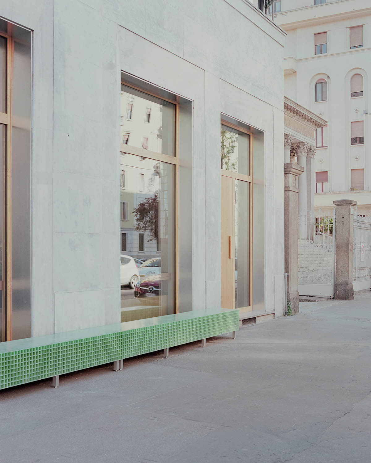
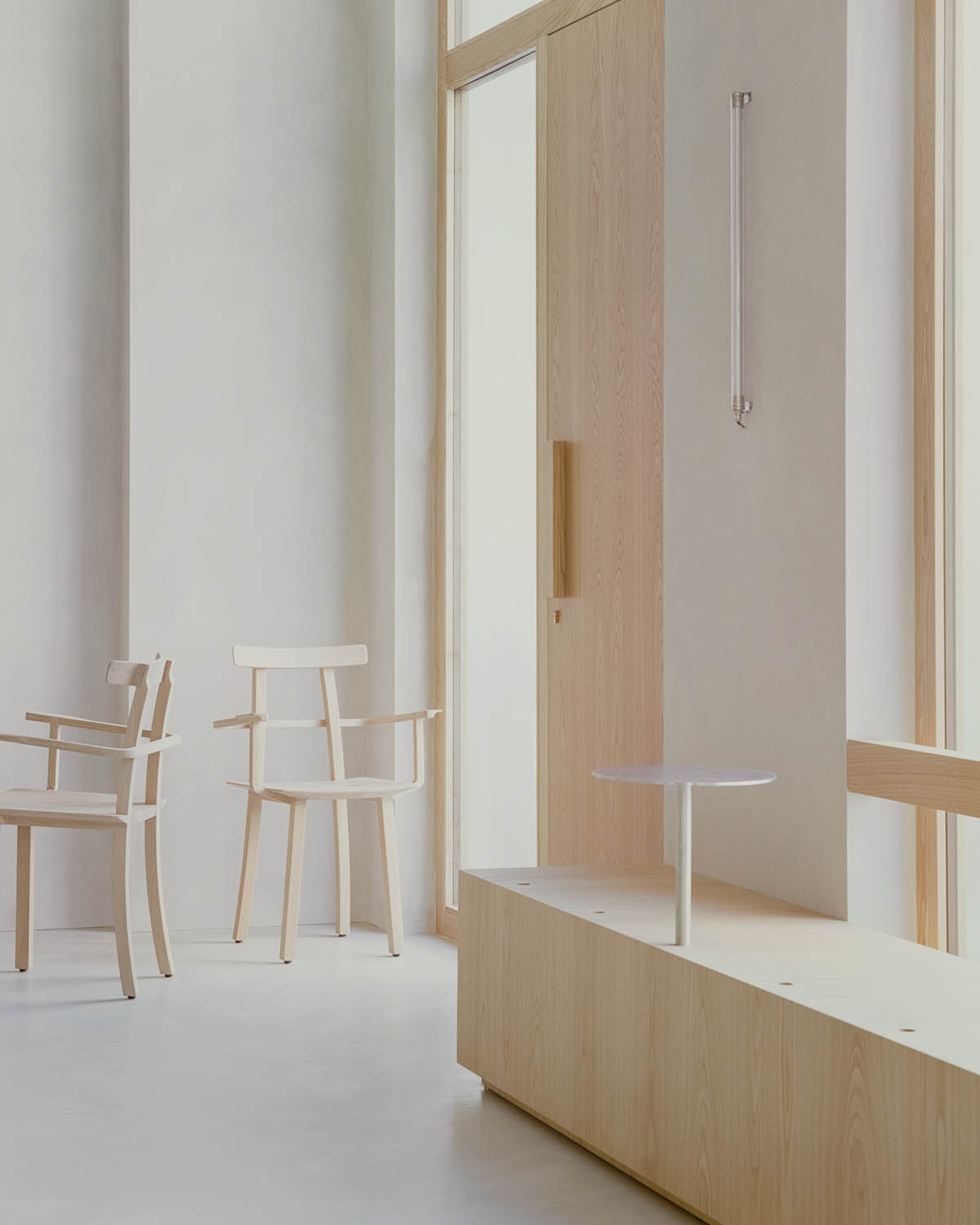
"The primary intention was to create a close relationship with the neighbourhood; large windows in chestnut wood with external jambs in galvanized sheet give the city a new, rigorous and precious front," said studio wok.
"The large windows project the interiors of the venue outwards, creating a hybrid "threshold space" between the domestic and the urban," the studio added.
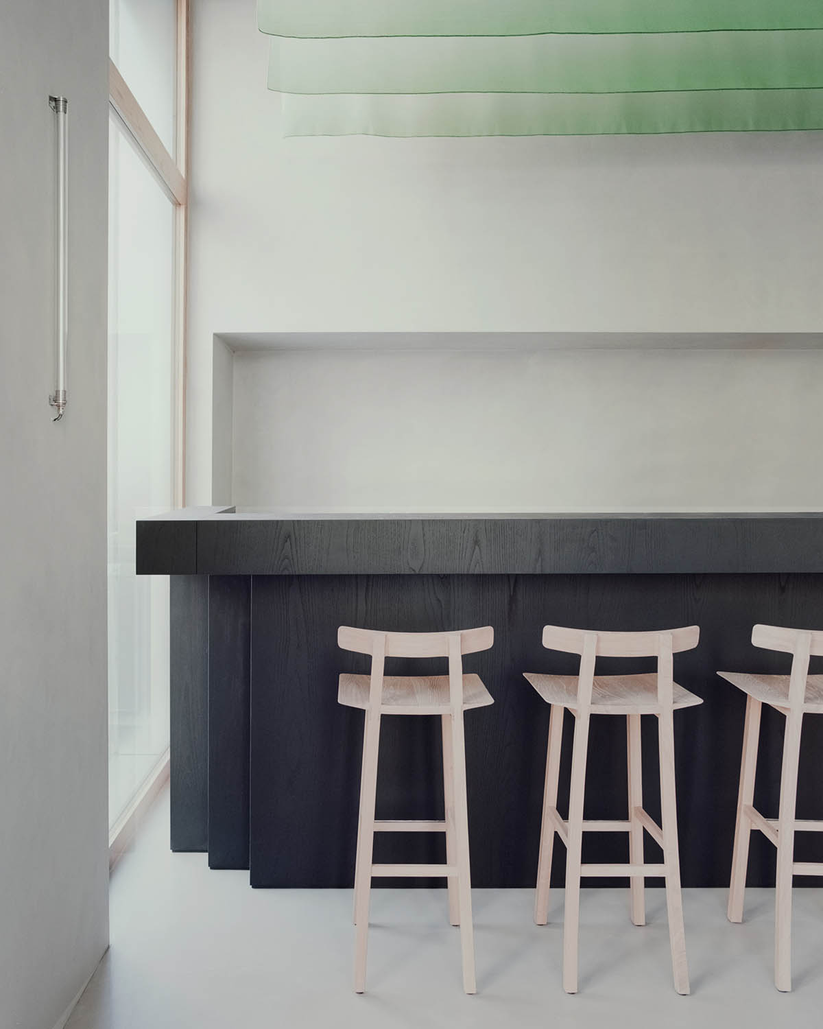
Inside, customers are welcomed by a neutral cladding, a container in which a few elements with a strong character become protagonists. The two counters, bakery and bar, make up the main functions and identify the space.
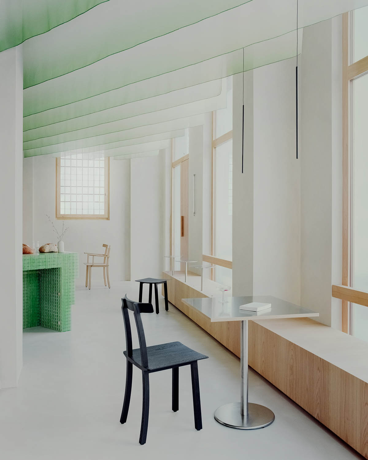
The studio described these two elements as "well-defined souls" but at the same time they could coexist in a fluid and natural way in the space: a long wooden bench runs internally along the wall towards the street, almost as if to connect the two rooms of the venue.
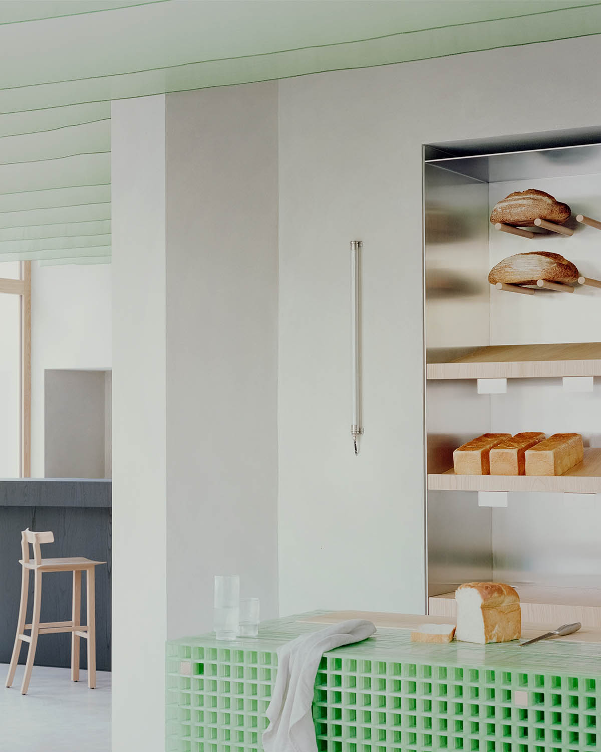
According to the studio, the bread counter is the protagonist of the space as soon as a customer enters the space, and the customer perceives its material anticipation in the external bench.
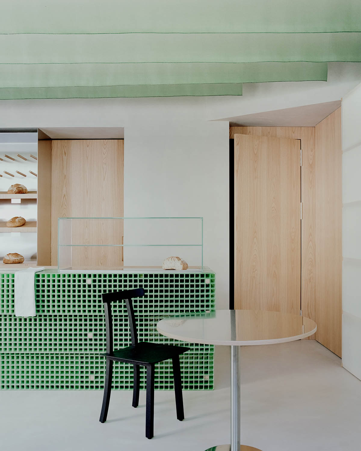
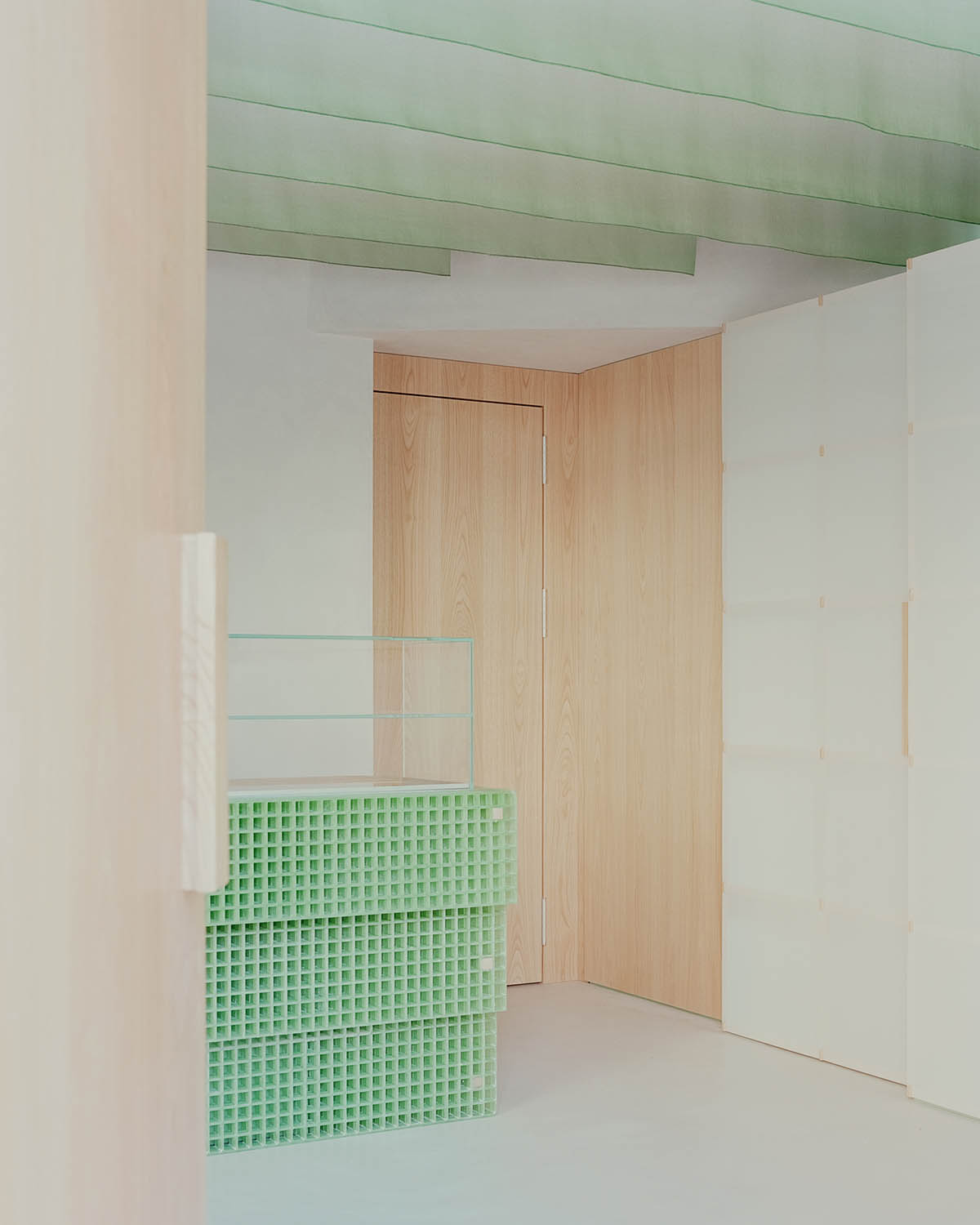
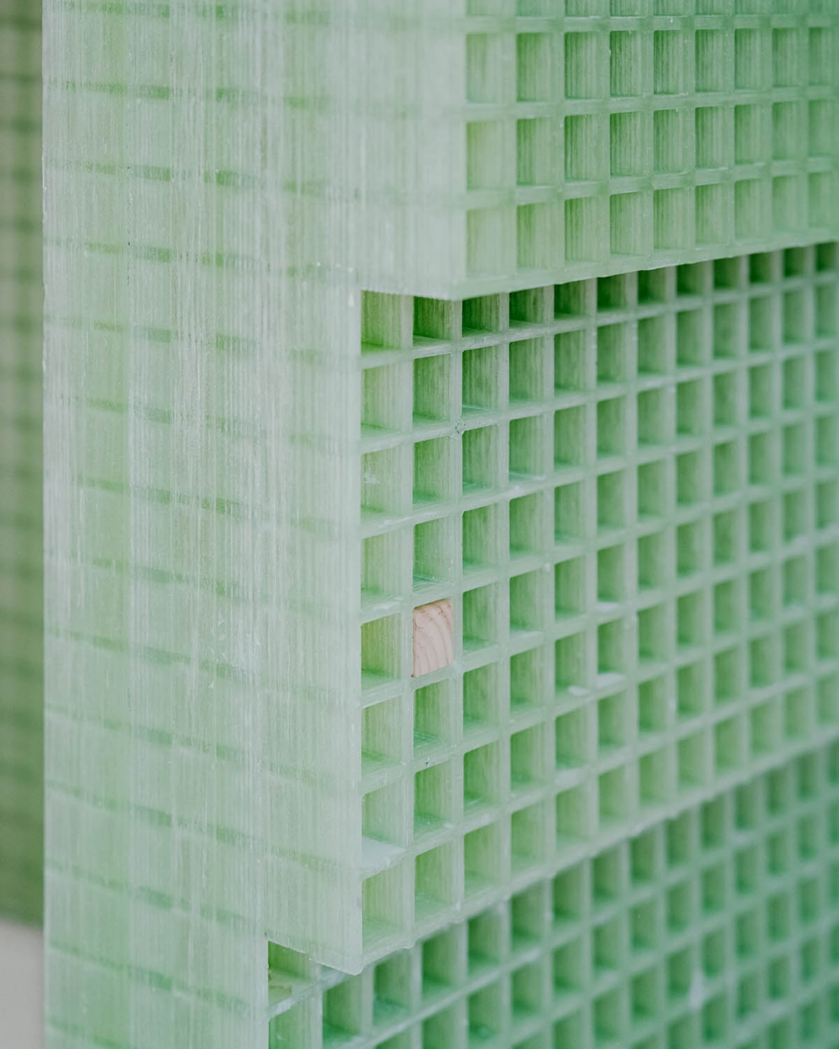
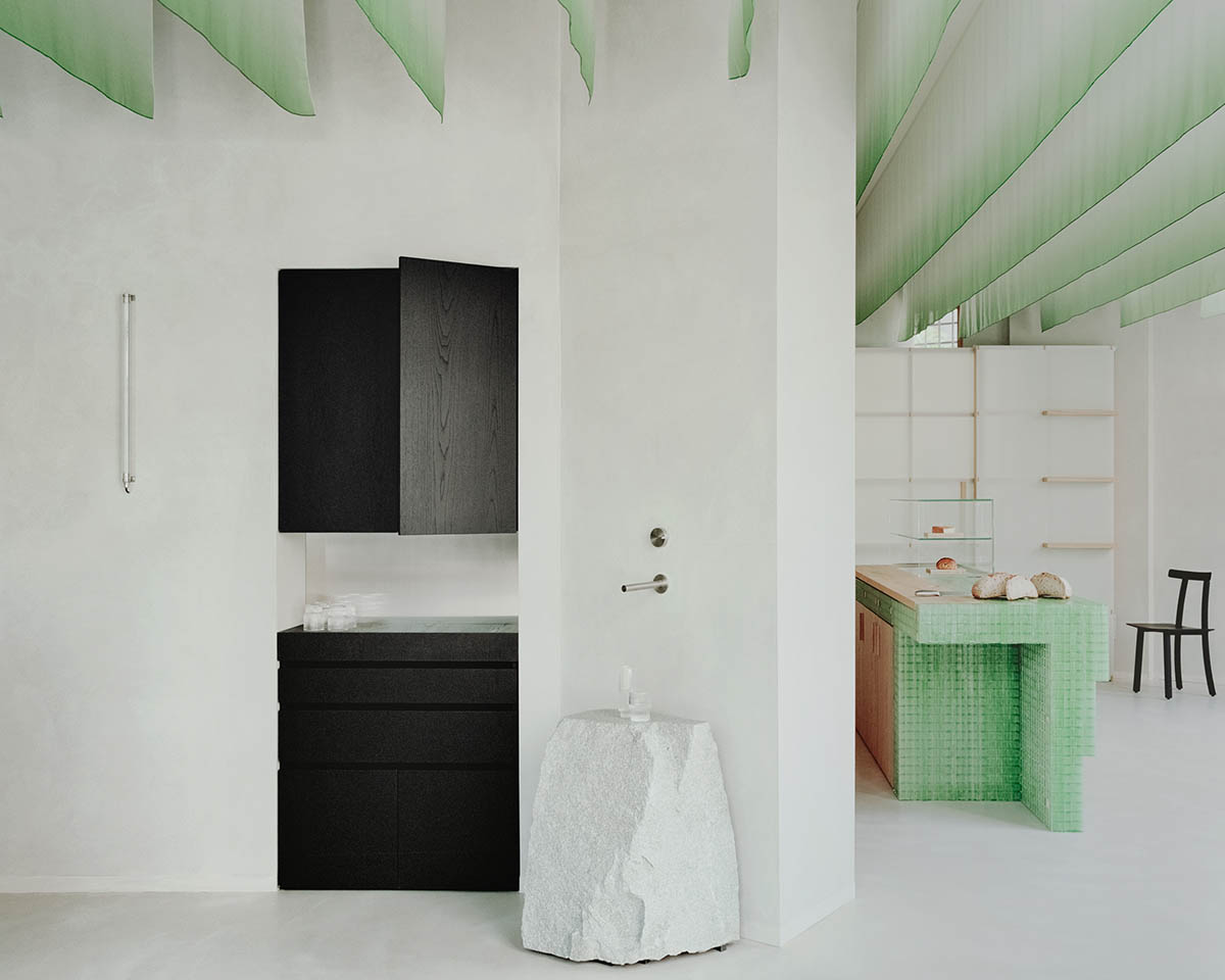
Made of green fiberglass grid panels, it is a small piece of architecture that inhabits the space and reacts with natural light.
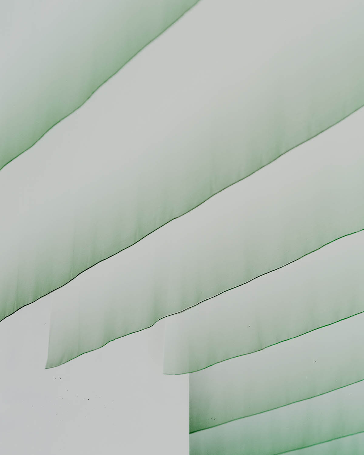
"Its color dialogues with the nuanced shade of the noren, the ceiling drapes that create a suspended three-dimensional world, both continuous and ephemeral," the studio added.
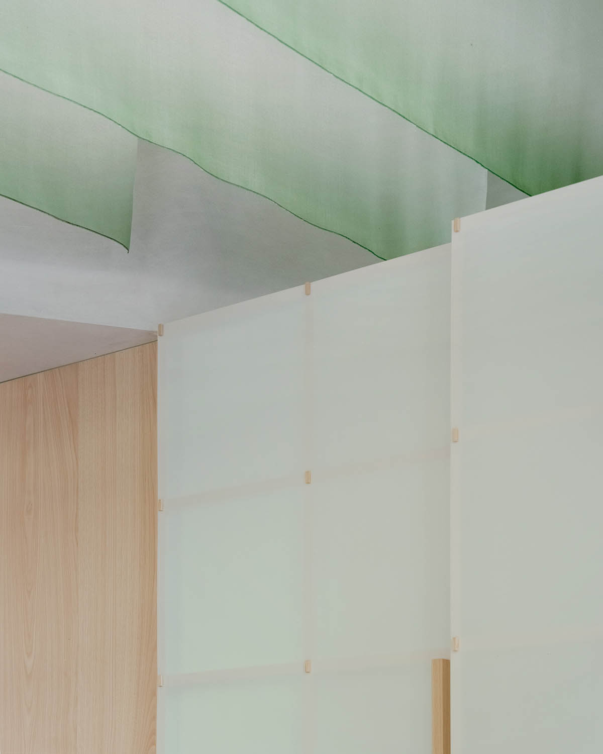
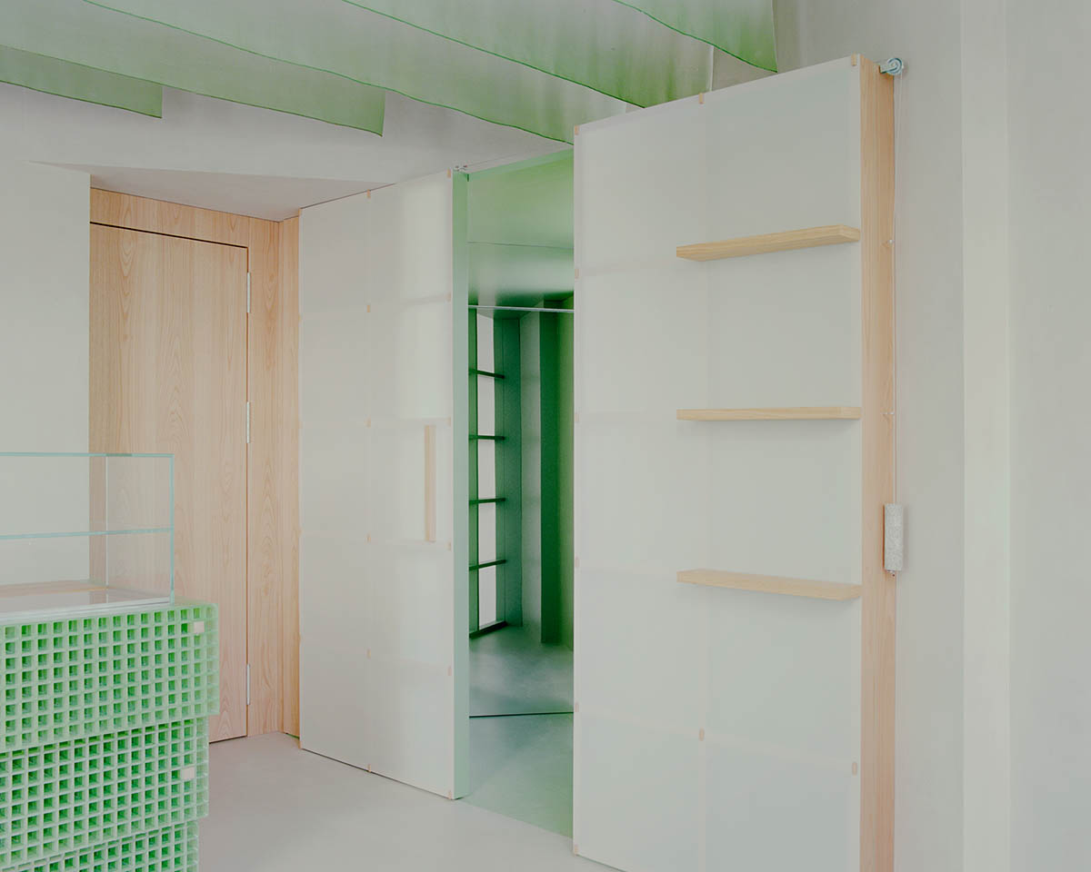
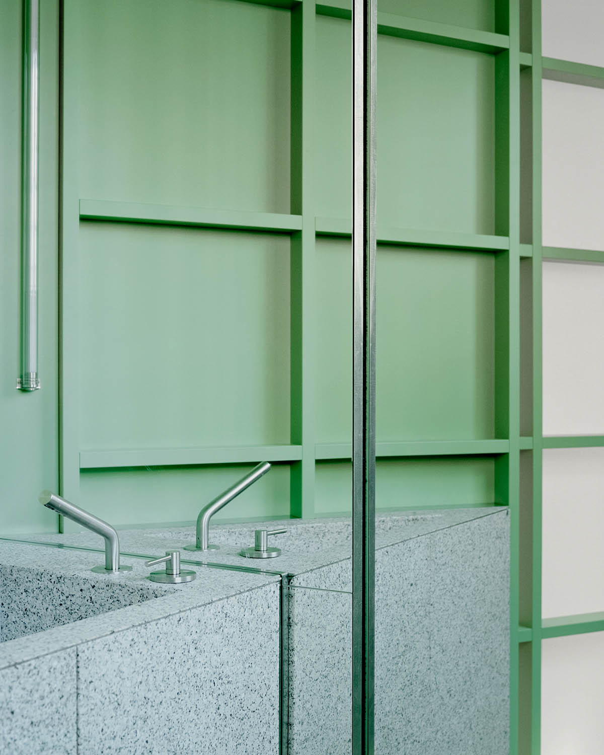
The wall and sliding system of the antebathroom act as a backdrop to the room, made with a wooden frame on which translucent panels in pressed cellulose are fixed, anticipating a green monochromatic box from which the monolithic element in Moltrasio stone of the sink emerges.
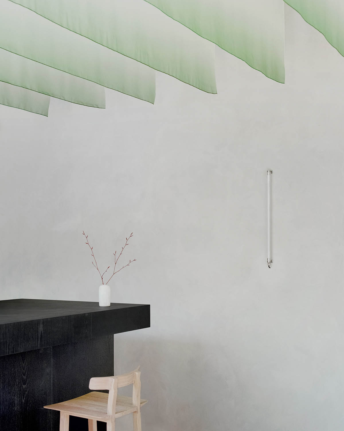
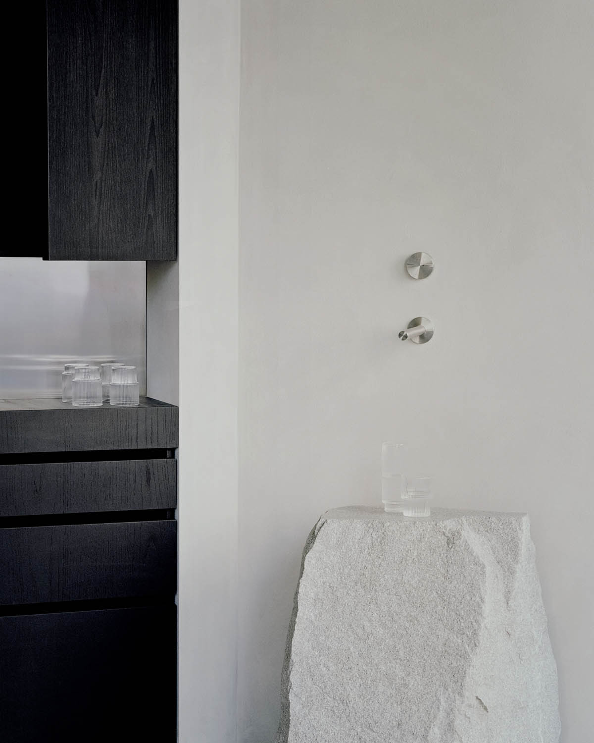
The area dedicated to the bar turns towards more sober nuances, with the black-stained chestnut wood of the counter and the stainless steel inserts as the protagonists.
A cleft boulder in natural stone restores the balance of the material palette towards an almost spiritual atmosphere, celebrating imperfect beauty and adding emphasis to the water filling ritual.
"As in the chef’s cuisine proposal, in the architectural project there are references to Japanese culture as well, non-literal and far from stereotypes," the architects explained.
"The intention was to add a layer for a deeper understanding, without it becoming too invasive, working on the concept of quality, both in materials and in details."
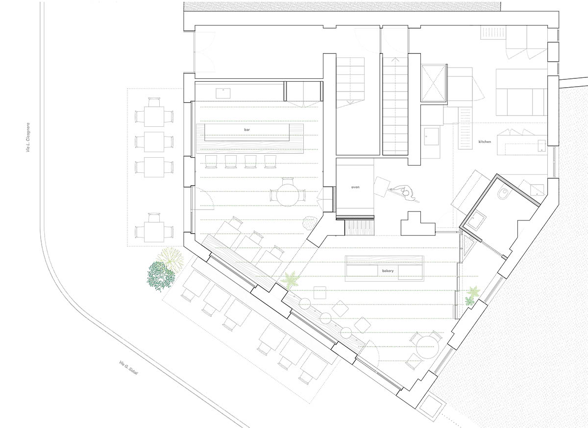
Floor plan
studio wok also designed a restaurant that takes cues from the hues and elements of Sardinian's local landscape in a beautiful setting of Porto Cervo, Italy.
Project facts
Project name: Pan
Architects: studio wok
Location: Milan, Italy
Completion: 2023
All images © Simone Bossi.
All drawings © studio wok.
> via studio wok