Submitted by
JIANGJIE DESIGN Converts Cylindrical Cement Plant Into A Fashion Store In Hangzhou
teaserf-84-.jpg Architecture News - Aug 06, 2021 - 11:00 3071 views

Chinese interior design studio JIANGJIE DESIGN has converted a historic cement plant into a fashion store by using grey-colored palette and mirrored surfaces that carry the traces of the old structure.
The building, named EvenBuyer Store, is located in Zhuantang Town, Xihu District in Hangzhou, China and known as The Shuangliu Cement Plant.
The site was known as the most important building materials Industrial Zone in the suburbs of Hangzhou in the 1970s.

"Machinery roared and flourished for a time, until it was closed down in 1999. The factory is abandoned, while the factory buildings stand in the flood of the times, and space survives as the witness and recorder of time," said JIANGJIE DESIGN.
Twenty years later, the Shuangliu cement plant has been transformed into a cultural and creative artistic Park, and the production activities are renewed in a new way.

The site of the project is the clinker storage area of the original Shuangliu cement plant. The building is comprised of four huge cylinder structures that are arranged in one line to form the main body of the building, and the internal interconnection is connected.

The building was designed for Evan Buyer, who aimed to use the language of architecture and design to describe the company's own style label and fashion attitude. The company commissioned Jiang Jie's interior design studio for the architectural renovation and interior design.
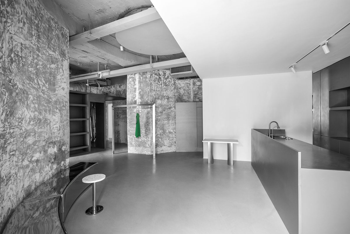
The designers wanted to combine the features of old building with new fashion, as the studio explains, "the breakthrough point of design is to retain the natural imprint to the greatest extent, integrate into the contemporary minimalist design aesthetics, and trigger interesting dialogues across time and space."
"Just as good food materials only need to adopt the most simple cooking methods, place yourself in the rich connotation of the building, just the right interior design, can present delicious food," the firm added.
Project
Due to the special architectural properties of the old structure, the storefront space area draws on a large and long strip, while the product category and quantity of buyer's shop are various.
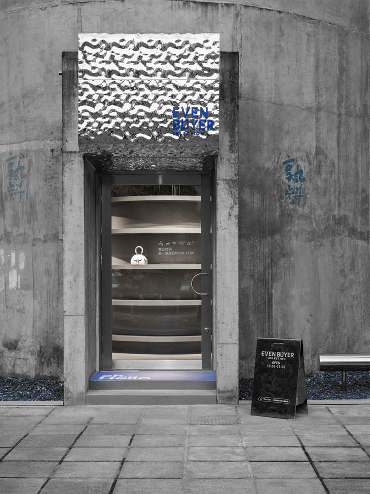
The designer wanted to create a coherent and rhythmic space atmosphere inside. By placing three boxes in four cylindrical spaces, the space is arranged in three parts. The designers make use of the original door opening of the facade, and uses one as the main entrance of the store, while the other three become the floor window. Four small windows of high-rise buildings should form a common rhythm.
Entrance and details of facade
Floor to ceiling windows provide plenty of natural light and are also used as windows to display the seasonal recommendations of the store. The flat screen of window stickers is in contrast with the products. The unified stainless steel corrugated board floating eaves is in contrast to the original cement texture of the building, which first brings visual impact to the arriving visitors and makes curiosity attract people into the store.

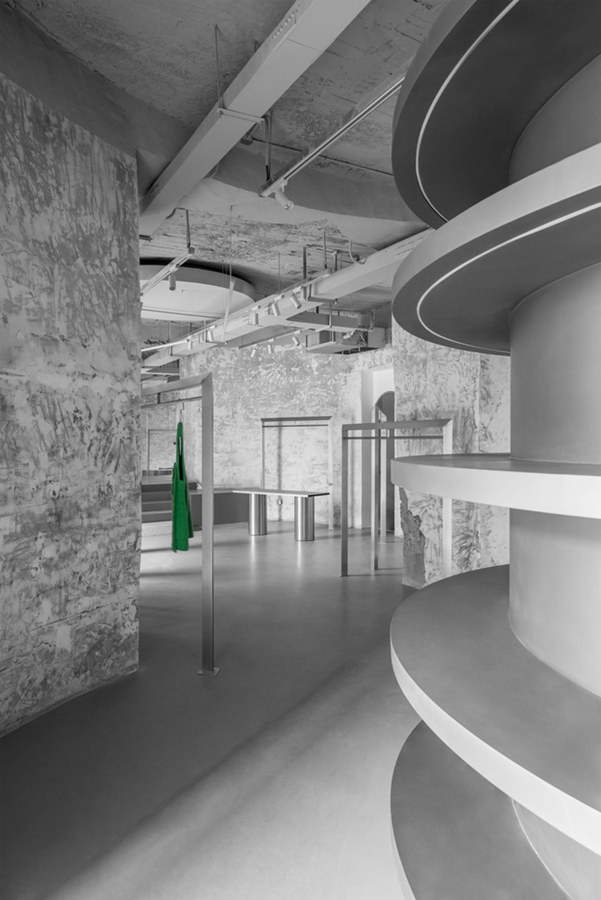
Circular shelves to the entrance
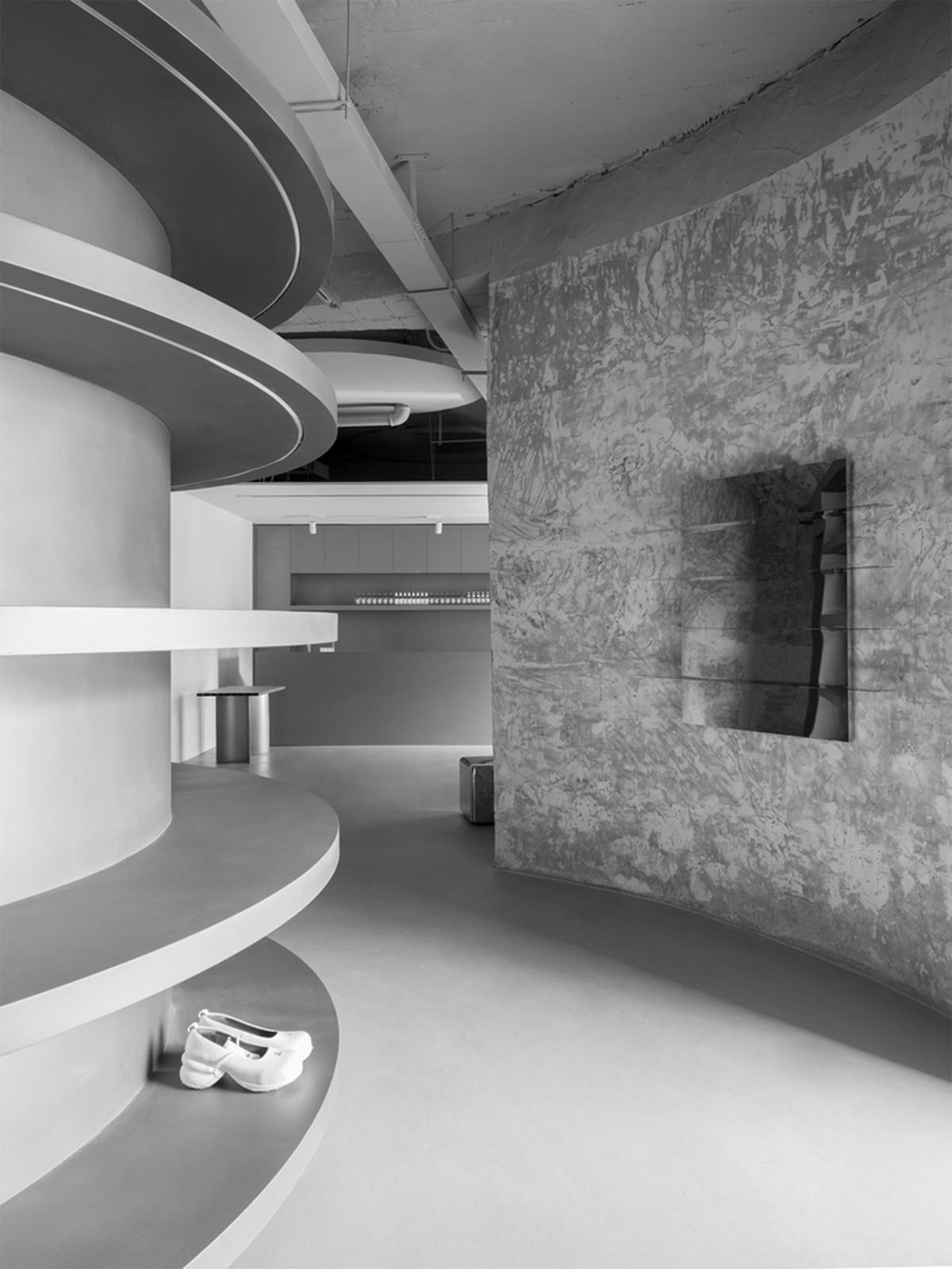
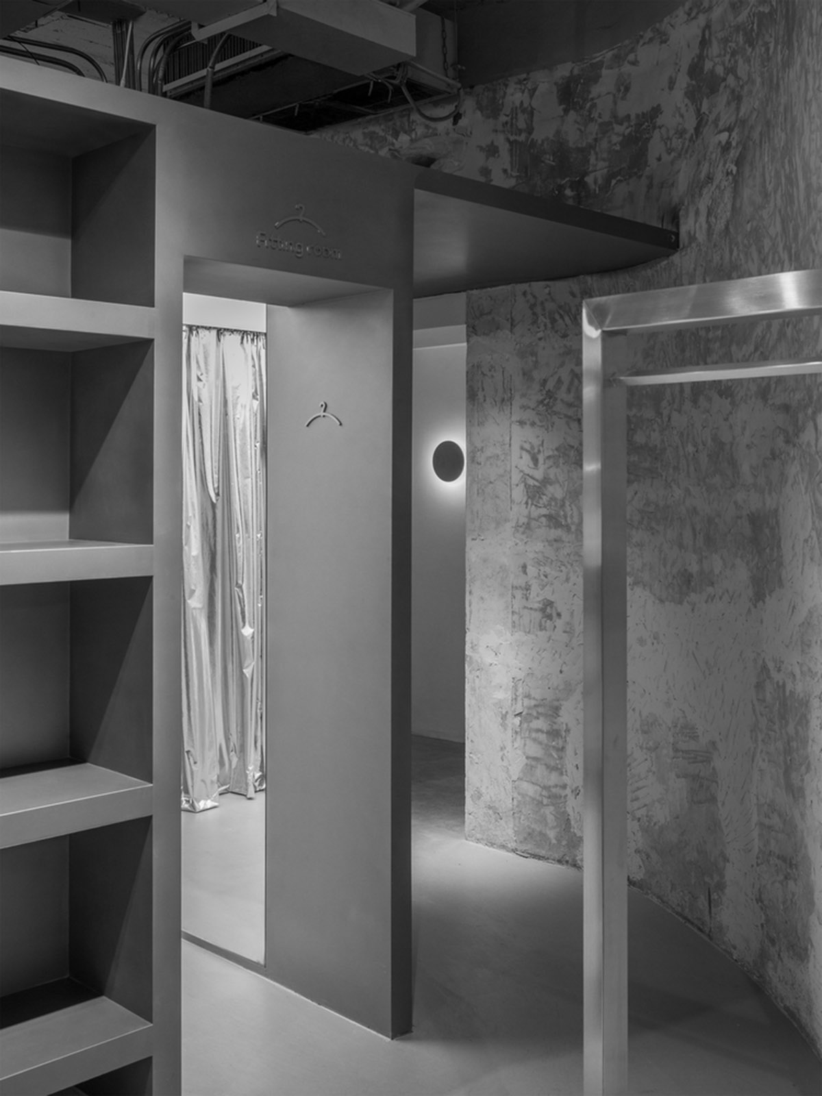
Based on the original building structure, the office area is designed parallel to the entrance of the store. The designer disposes floating circular arc-shaped laminates at the entrance. The interior is a functional block which takes into account the fitting room / live room.
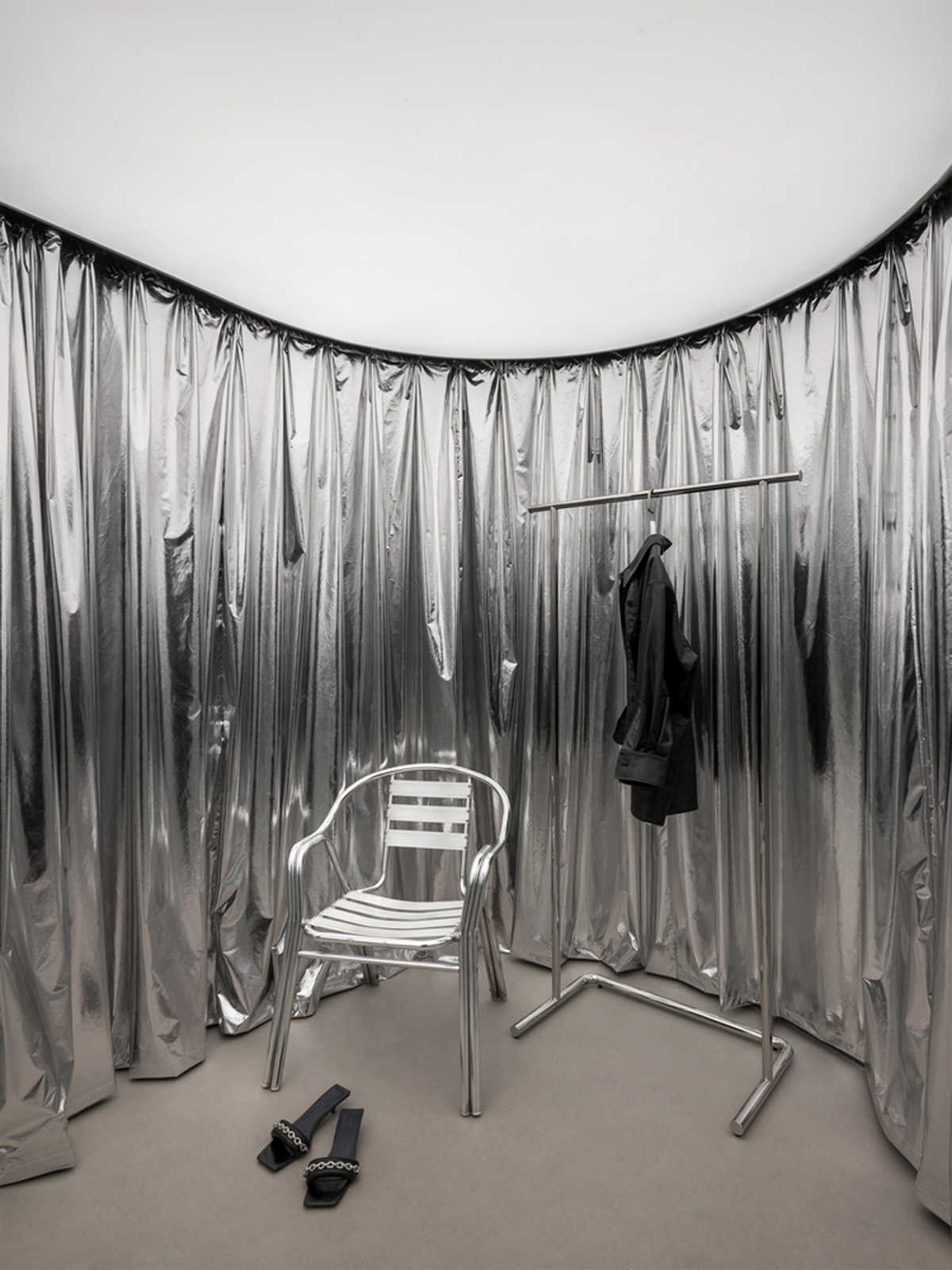
The material is made of light-emitting film on the top surface and a complete mirror reflection. The inner barrel space enhances the sense of depth. At the same time, the whole block hides the entrance of the office area behind it.
In addition to being used as a partition, the moving line after entering the store is divided into two parts by taking the laminate as the symmetry axis. The arc path also brings more interest to the space and creates a multi angle scene to show the core products for the brand.

The circular arc shape of laminate should be generated by spatial form. In the perfect integration at the same time to leave a gap, to maintain spatial connectivity, create relaxation degree, a sense of breathing space.
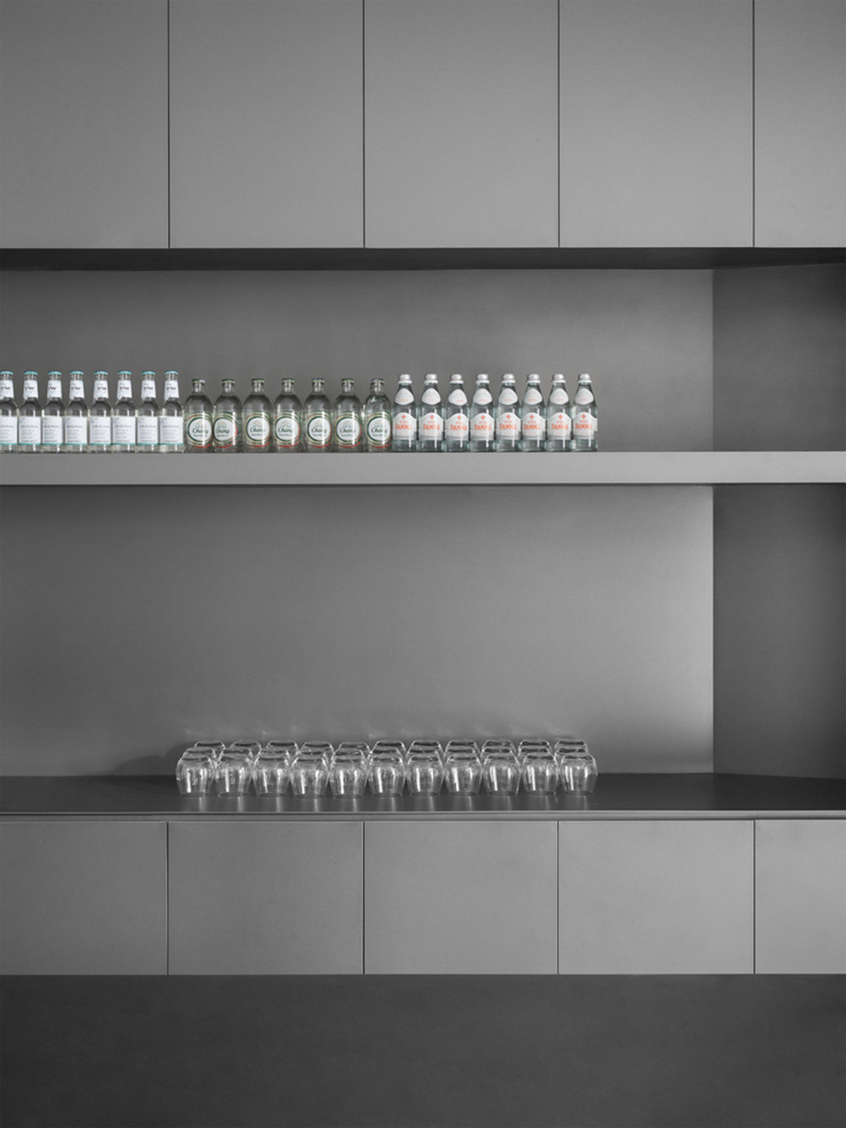
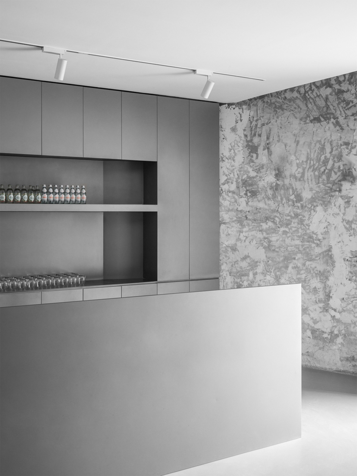
After entering the store, the bar area is on the right. The designer uses the simplest stainless steel square block to divide the space into two and separate the passageway leading to the bathroom. To the left is the clothing / Footwear display area. The designer uses the staircase between the two cylinders as a continuous space experience.

Stairs Showcase
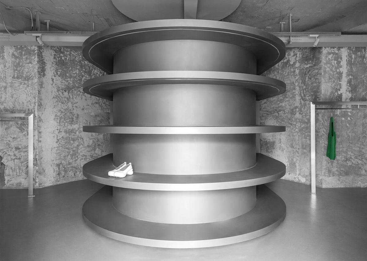
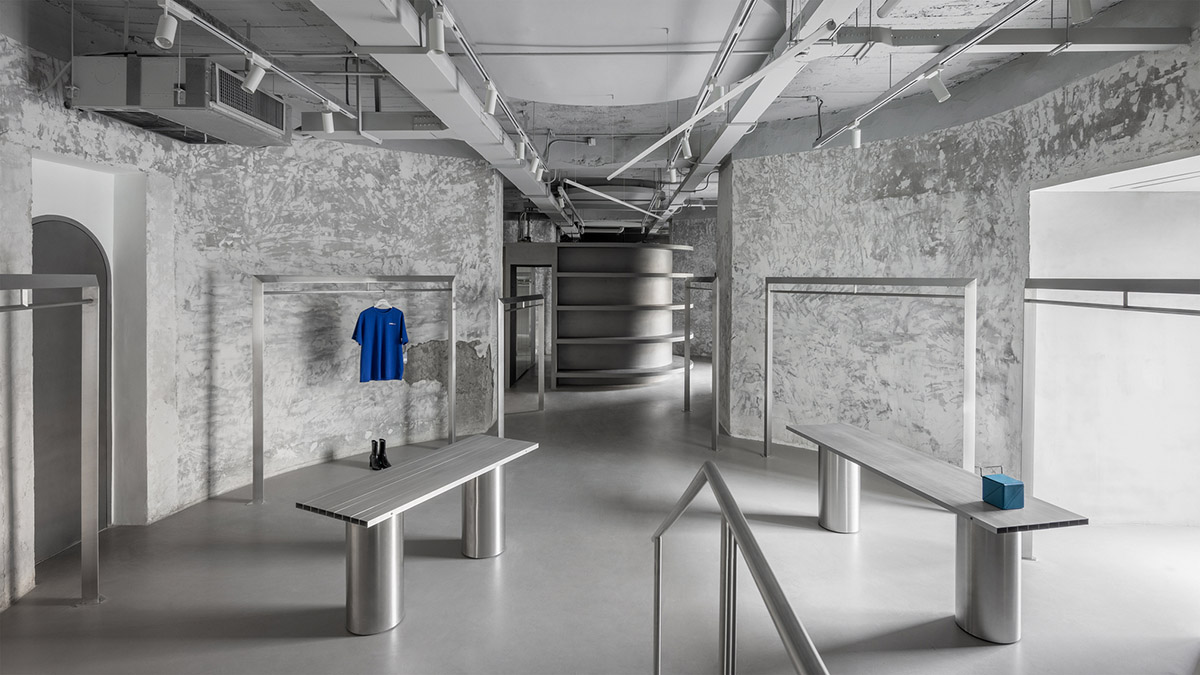
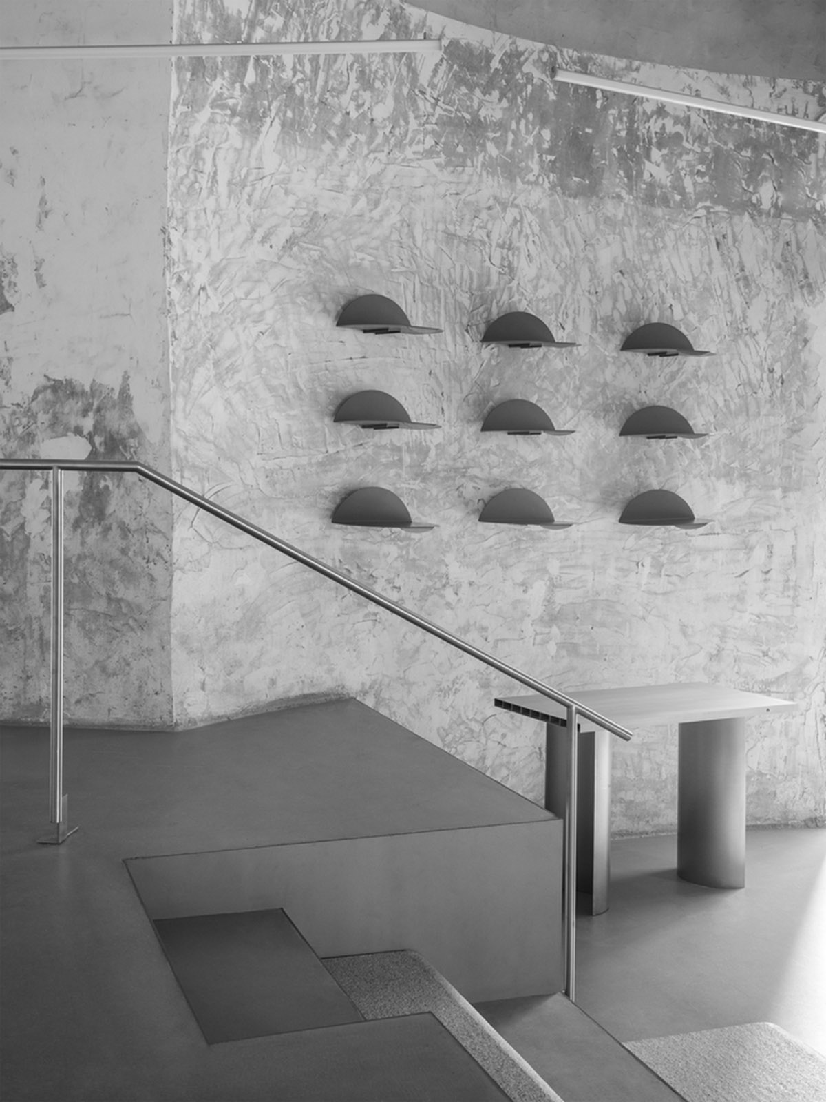
The same dialogue continues throughout the space. Enter the clothing / Footwear display area on the left, and the space makes the product the main character. The floor type clothes hanger is placed in a more casual and loose way with the exhibition stand. Between the two cylinders on the left, a huge stair crossing stand divides the space and establishes a new connection.
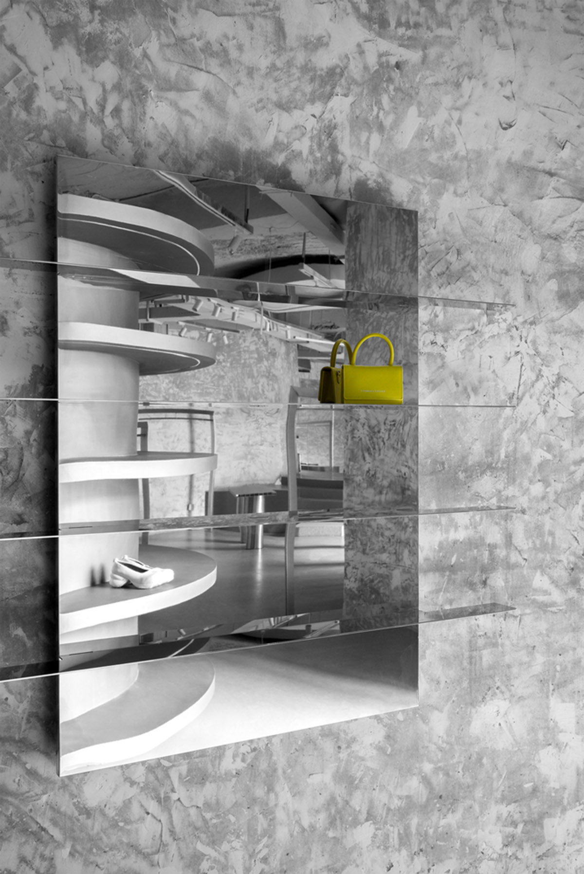
The height difference of the staircase platform blocks part of the customer's sight, stimulates more curiosity and exploration desire, and drains the cold area farthest from the entrance. The rich visual feeling formed by the high and low staggering also ensures the sense of hierarchy and interest of the space on the long-distance moving line. A large area of mirror is added to the booth to cover the fire hydrant and meet the fitting needs and extend the space. When people walk on the exhibition stand, it will unlock a new perspective of the observation space.
Details
The dialogue between delicacy and coarseness, contemporary texture and original texture.

Material
After removing the painting surface layer, the original wall of the building presents the original blank state, and the unique texture is the imprint of the times. In this context, stainless steel and mirror materials inject strong contrast.
JIANGJIE DESIGN stated that "After its opening, Evenbuyer has become a new fashion clock out landmark in Hangzhou. Forty years ago, the cement plant provided raw materials for urban construction."

"Forty years later, the "clinker space" has become the vanguard and fashion stronghold of the city. With the transformation from industry to culture, architecture has gained its unique significance in the path of urban advancement."
"In the hands of designers, round and square, rough and delicate, original texture and modern materials, minimalist design language and current fashion items all constitute interesting intertextuality and response to "meaning", and finally converge into this relaxed and rhythmic space."
JIANGJIE DESIGN is an interior design firm that also focuses on customized commercial public space design, graphic design and furniture design in China.

Floor plan
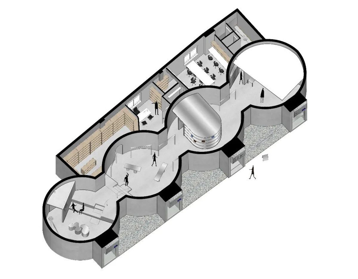
Axonometric diagram
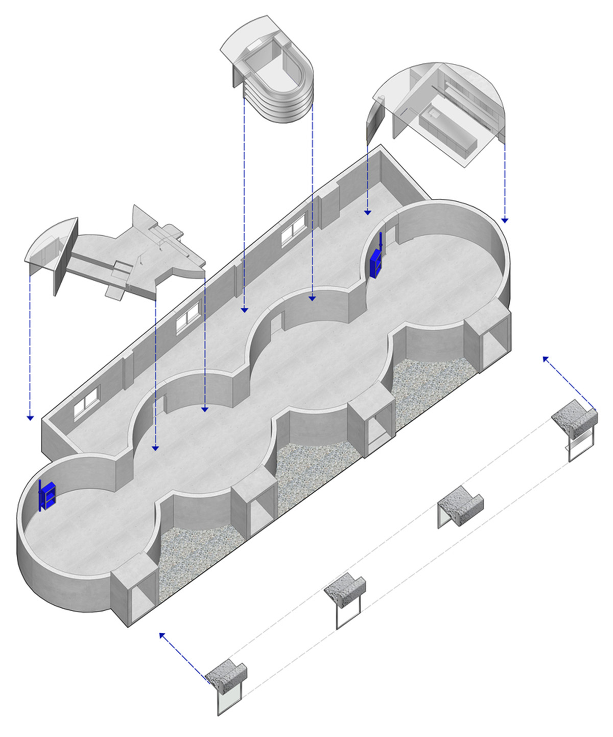
Axonometric diagram
Project facts
Project name: EvenBuyer Store
Architects: JIANGJIE DESIGN
Location: Hangzhou, China
Size: 320m2
Date: 2020
All images © Minjie Wang
All drawings © JIANGJIE DESIGN
> via JIANGJIE DESIGN