Submitted by WA Contents
Porto Architects designs all-white interior for wine concept store in Portugal
Portugal Architecture News - Jan 02, 2020 - 15:54 8779 views
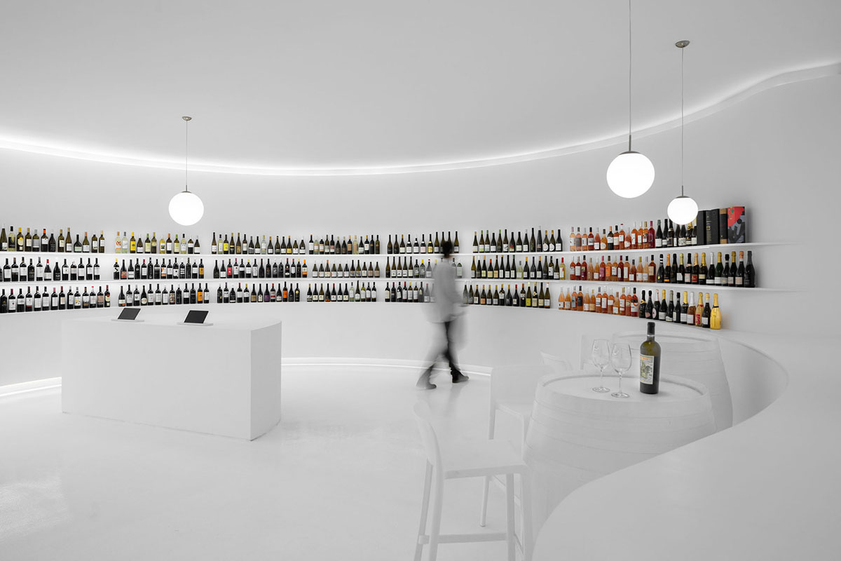
Portuguese architecture firm Porto Architects has designed an interior space washed by all-white surfaces for a wine concept store in Portugal.
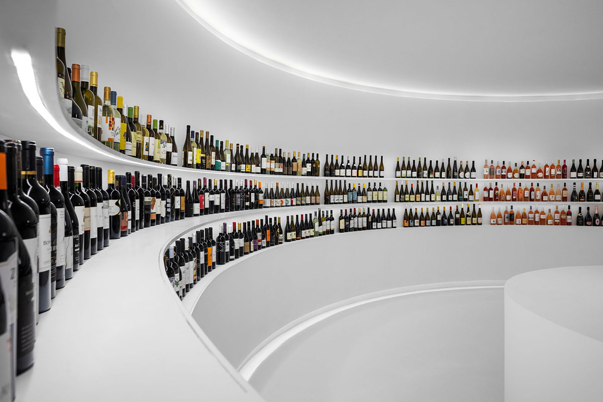
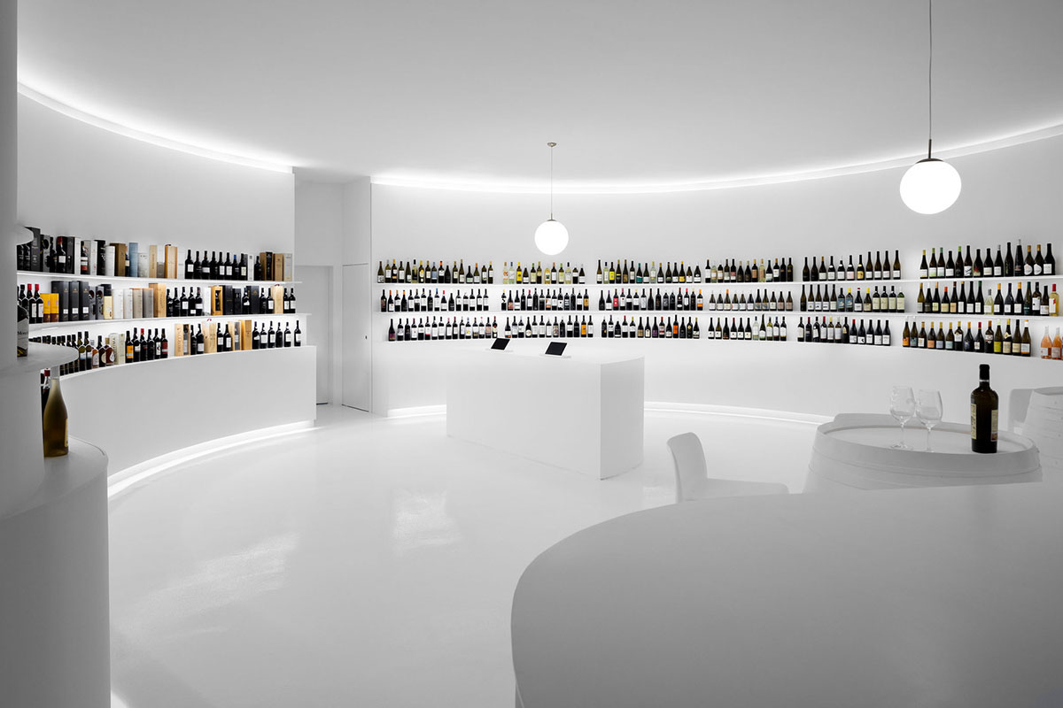
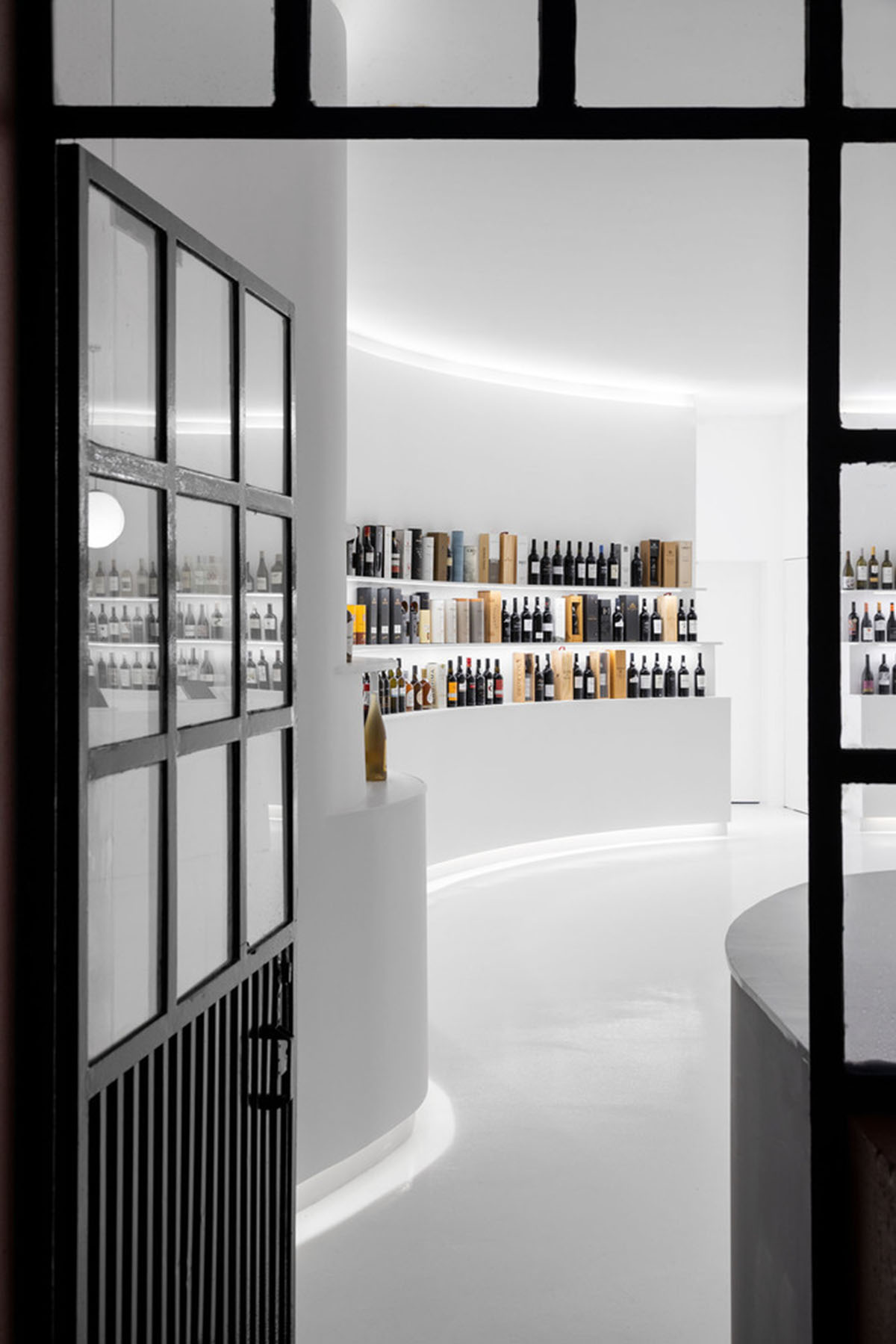
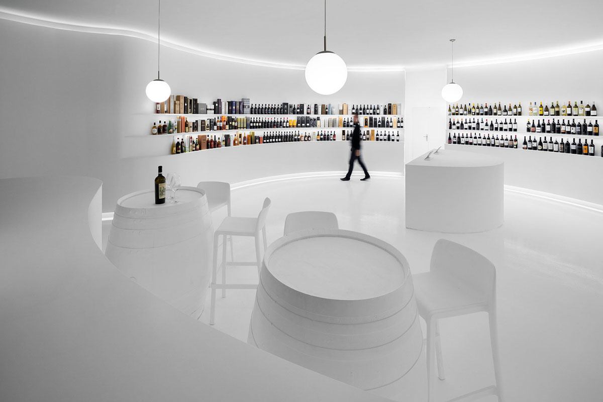
Named Portugal Vineyards Concept Store, the rounded store showcases a series of wines placed on white shelves with white furnitures. The store focuses on only the bottles of wines to attract visitors' attraction.
The architects were commissioned to design a wine concept store which is the first physical store for the online wine specialist company.
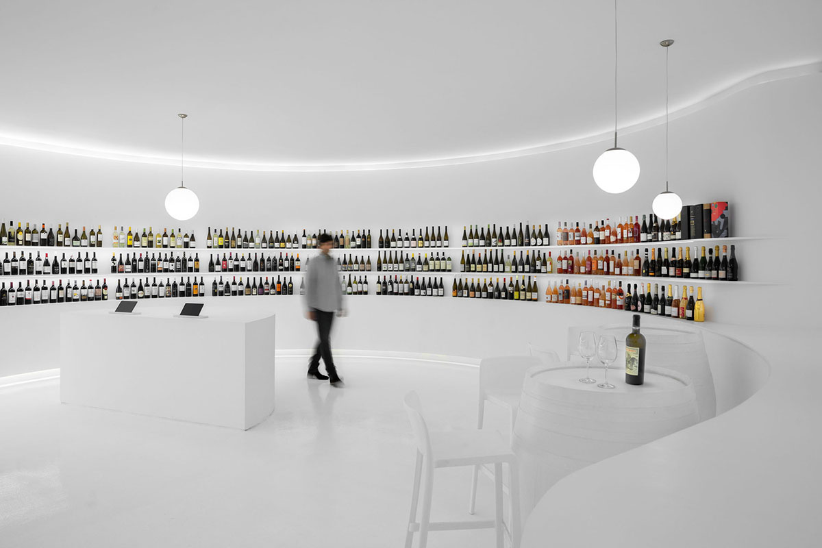
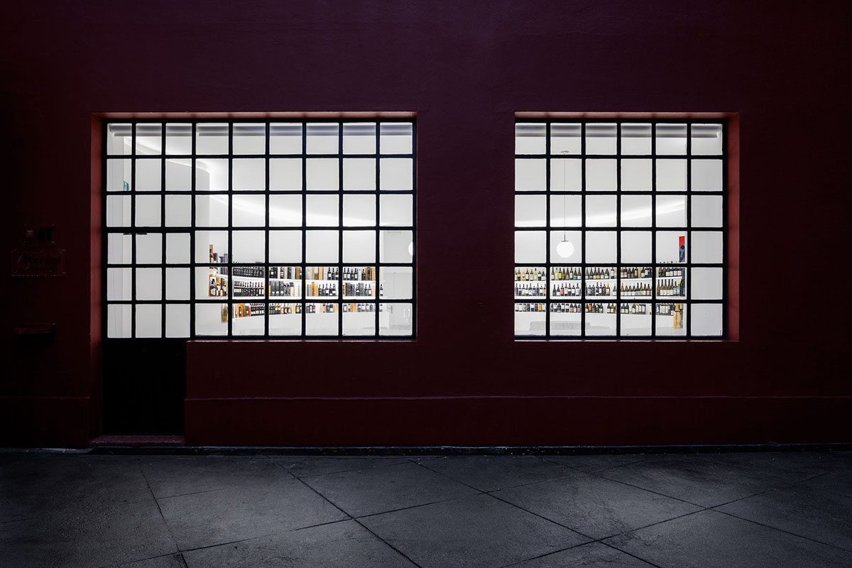
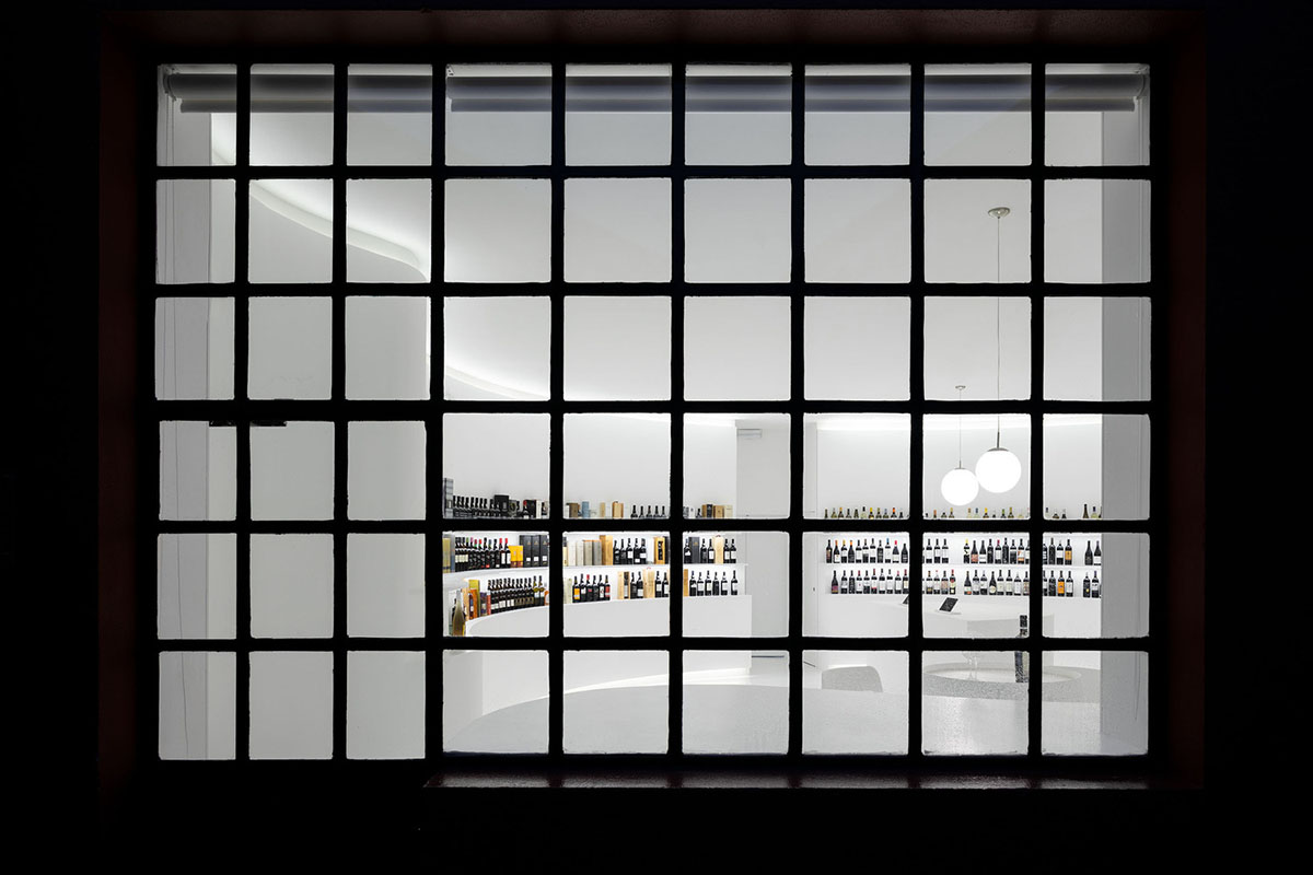
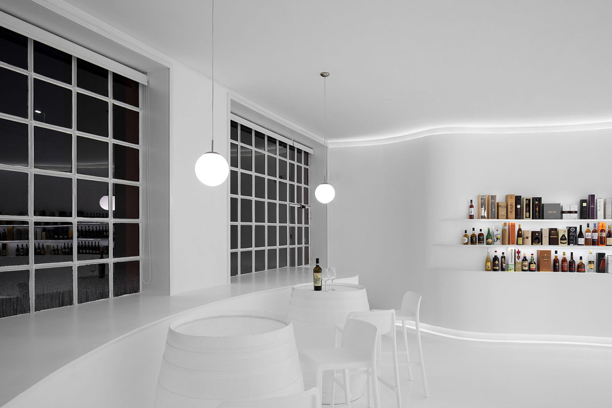
Located adjacent to the company’s headquarters, facing the street and occupying a 90-square-metre area, the store consists of an open-plan devoid of partitions. The space inside is blindingly white, minimal and circular.
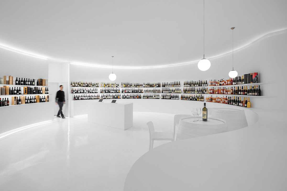
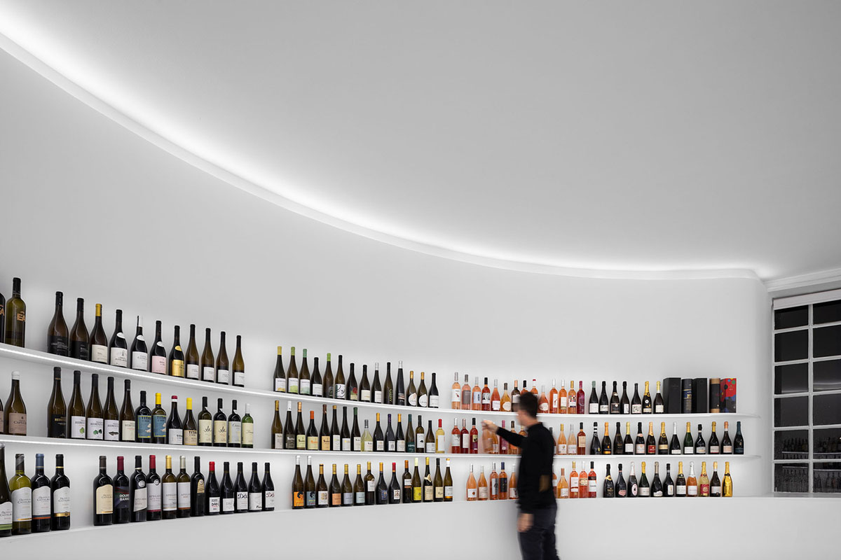
"The displays are carved out of the walls in reference to the vineyard terraces in a circular shape that fills the customer´s field of view sensitively with indirect lighting and the sharp contrast between the product and the space," said Porto Architects.
"This luminance creates the perfect background for the experience of observing the diversity the wine represents and a chance to take design back to its core in a chance to start something new."
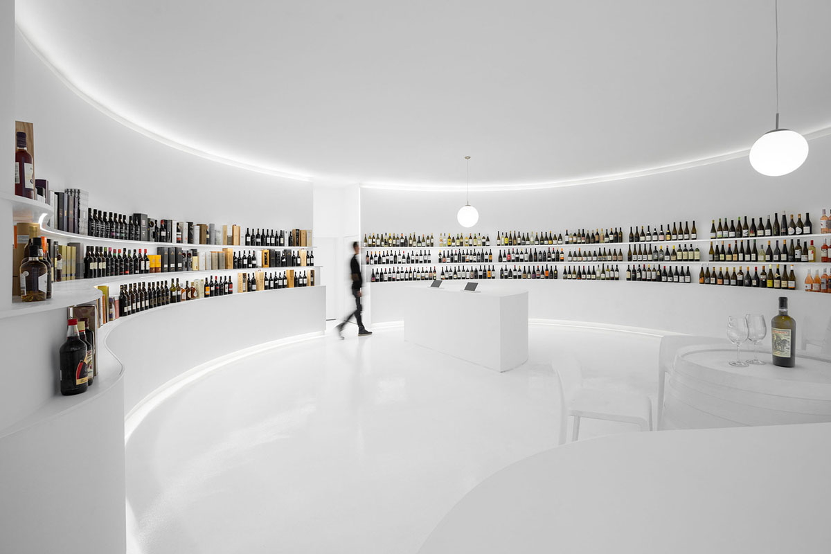
In this project the architects planned to celebrate the wine bottle, its shape and the brightness of its colored glass without lies – an interior using a simple form and the purest and neutral color.
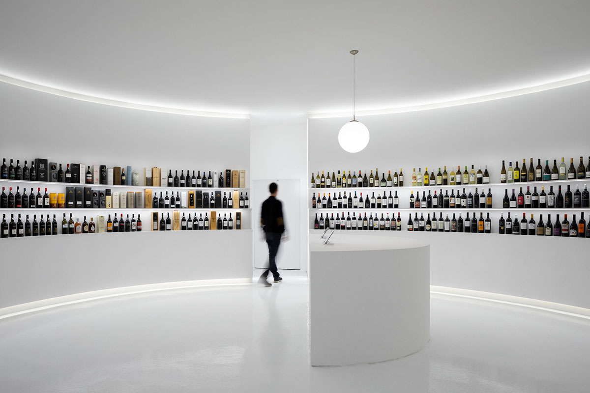
The visitor's experience begins with the perception of the curved walls and circular path that surrounds one soon after entering the interior.
"The approach was to focus on creating a space that could emerge from the access points and develop a feel of inner space defined by the three wine terraces that exhibit one of most extended collection of Portuguese wine," added the firm.
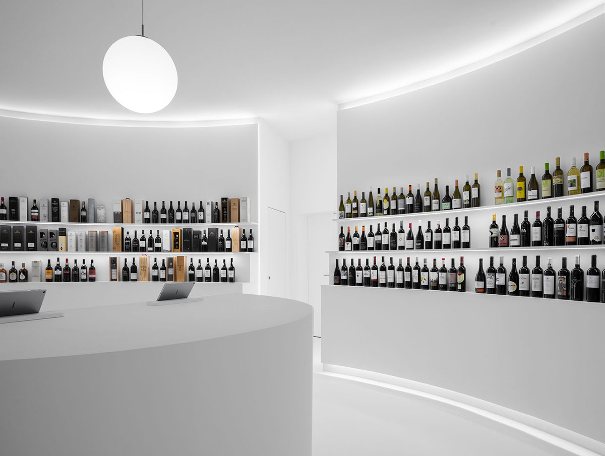
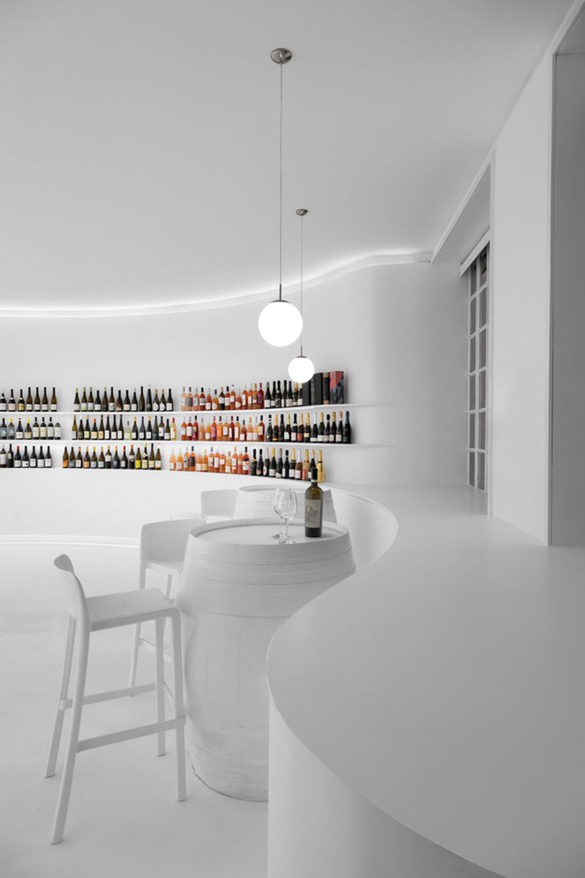
The wine terraces counters provide the studio's client the flexibility to organize the theme display and adjust these groups to suit market trends and seasons; to the visitor allows a 360º view of the store and a quick perception of the wine range.
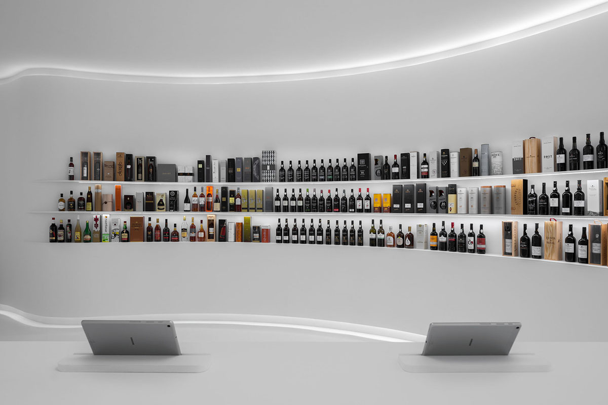
Without affecting these premises, an online counter space has been added, allowing a virtual tour of the warehouse, where the most and least known Portuguese wines are found, and a wine-tasting zone where the traditional wood barrels are integrated in the concept has bar tables to complete the experience of the visit to this store.
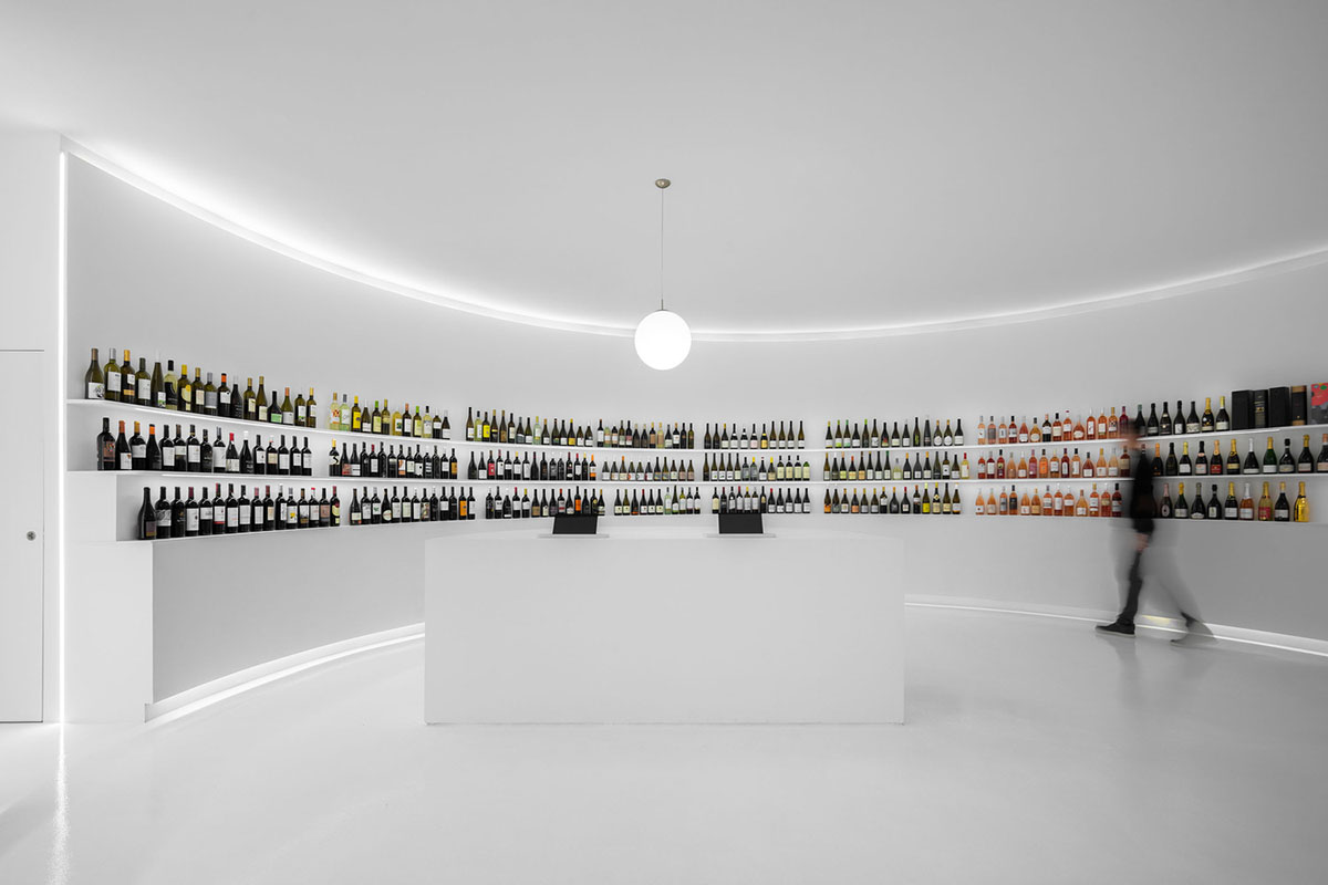
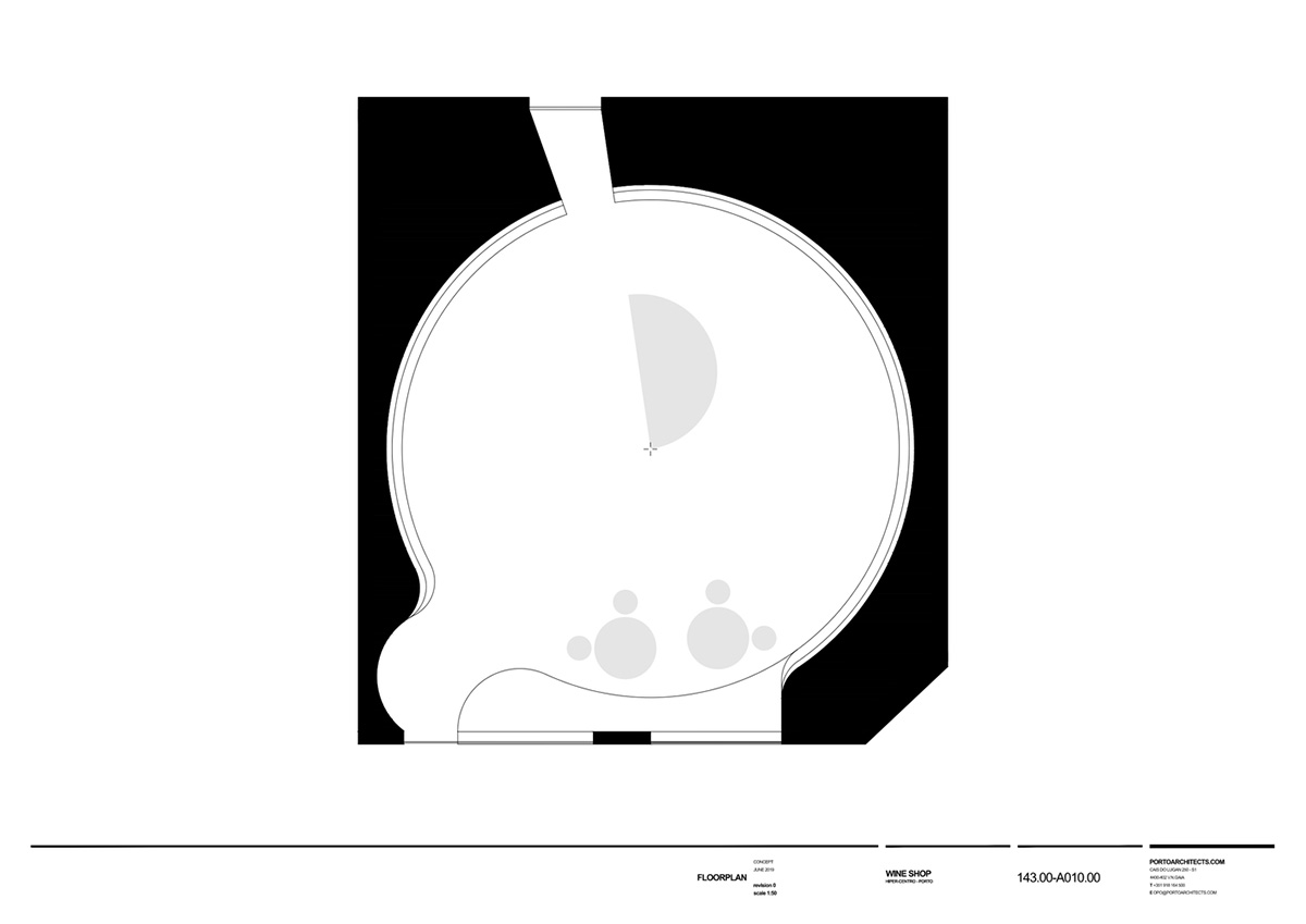
Plan of the store
All images © Ivo Tavares Studio
> via Porto Architects
